
There are now 10 ways to present each Product option (“attribute“) to arrive at the right product SKU. Categories can now also land on 2 different intermediate pages before the flow of selecting product attributes begin. Each has its own characteristic and user-experience, suited to different types of products and marketing messages.
Of the 10 displayStyle supported (as of Q1-2026), 9 of them take the user through a single screen for each set of attributes, in a wizard different step-by-step style. The latest displayStyle forces all the attributes into a single screen with conditional and multi pathways. Read all about the new multiSelect displayStyle in this tutorial.

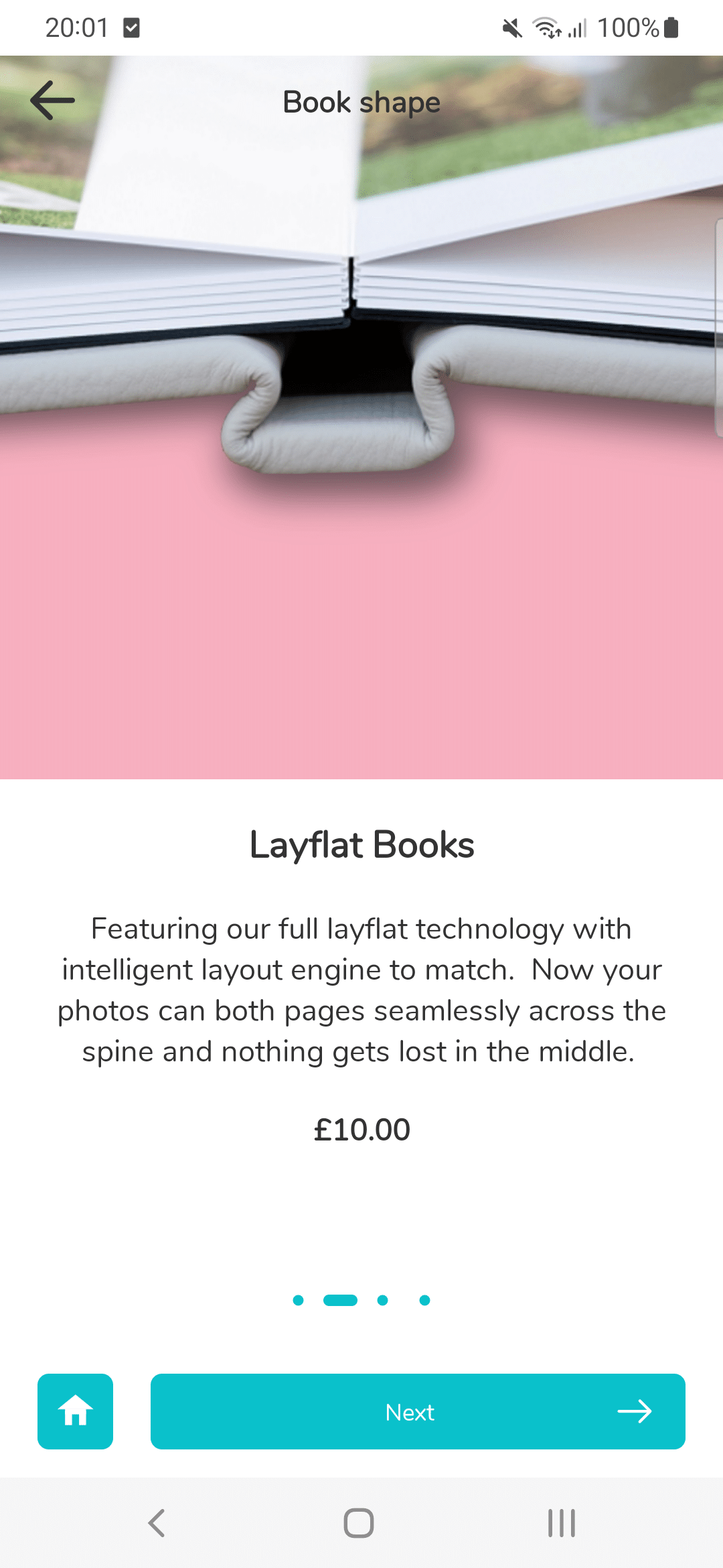
Ensures half the screen height is your image. One large image plus half screen height of text per product attribute. Useful is you need lots of text to explain each step in the product selection flow. (Design refreshed in late 2023)
This is the original "swipe" from v3 (2021). Text cards below, which corresponds to an image on top. Image is half the height of screen. Description text can be as long as needed. The cart will grow vertically to accomodate. The Price will always be slightly below the description.
This is Swipe 2.0 (v4, late 2023). Subtle design change where the price and Product Title is vertically centered in the text cards below. Note the limitations of this design: if you have Prefix and Suffix on your text, then you have very little space for the Name and Description fields for your product.
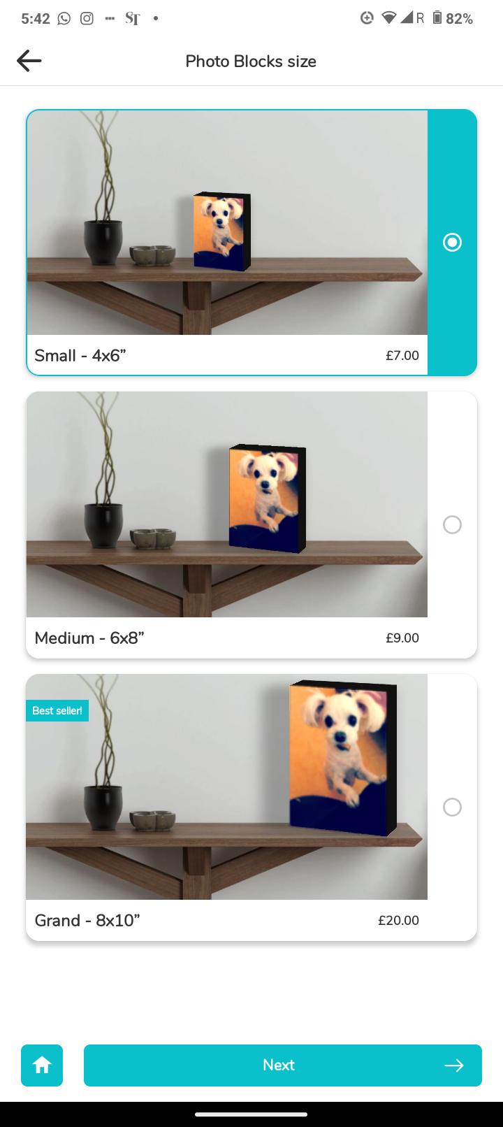
This design will automatically expand it's height if there are more text, but always maintain the 2:1 aspect ratio of the product image. Good for moderate amounts of text, and widescreen image.
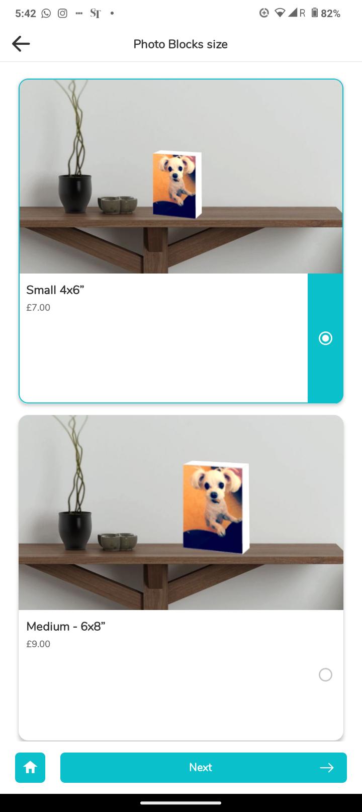
(late '23) Card is always square, with top 60% reserved for image. Price is also shifted to the left to be near the main text body. (useful for paragraph level text body which will not break up into two columns.)
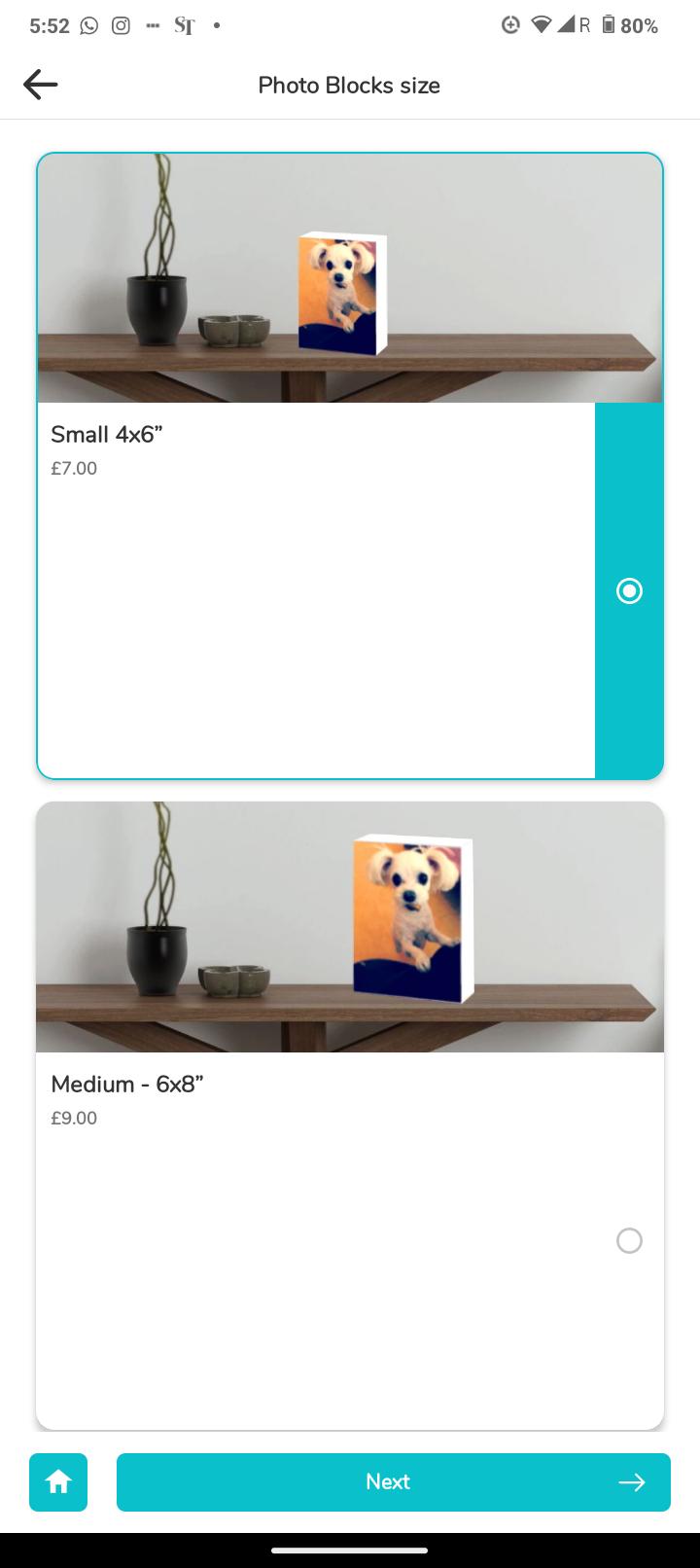
(late '23) Allows more text. 3/5ths height of the square card is reserved for text, with only 2/5ths for the image. This is useful if you should have alot of text. Else, the listWithHero will be more apt.
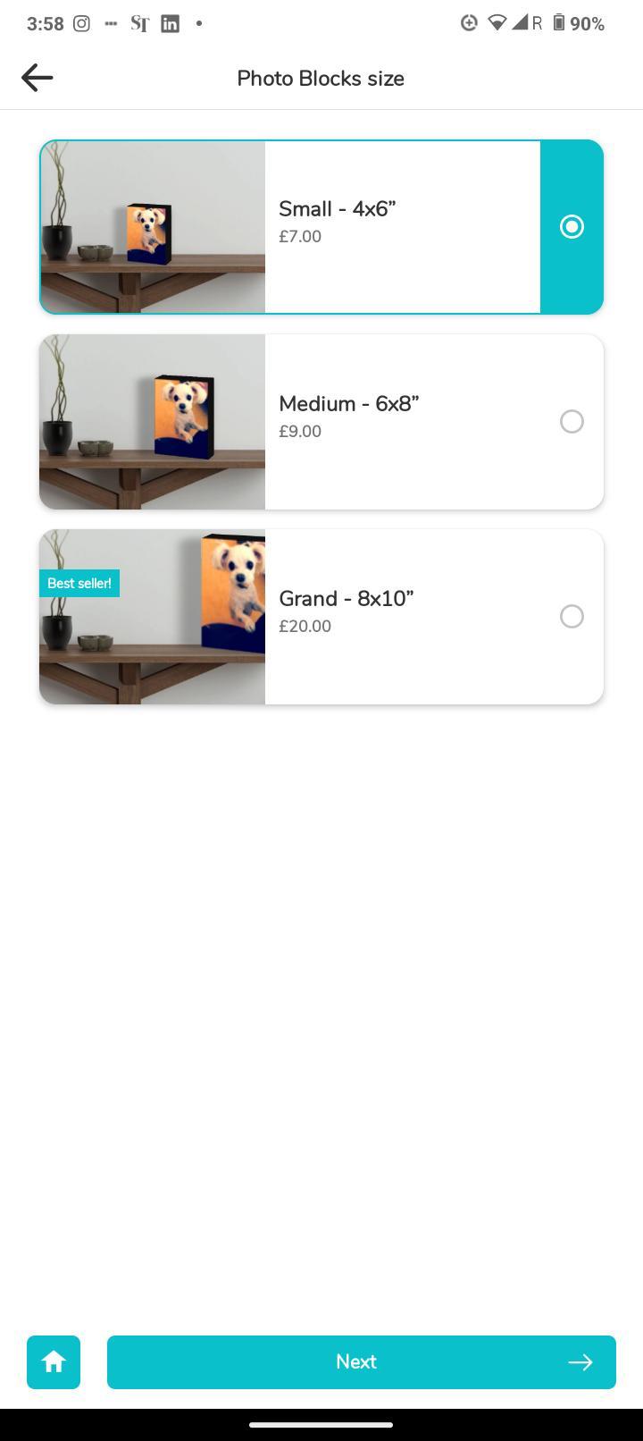
(late '23) The square thumbnail is encased in the card with rounded corners. A more modern take on the original thumbnail list.
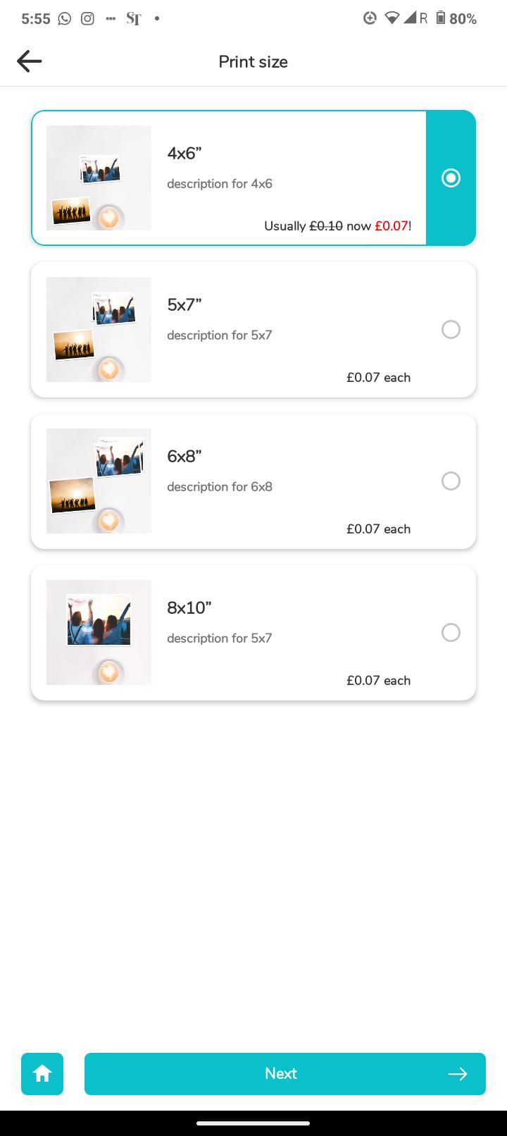
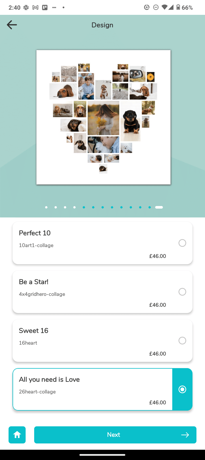
Thumbnail is always square. The card can expand vertically if there are long paragraphs of text, always remaining square.
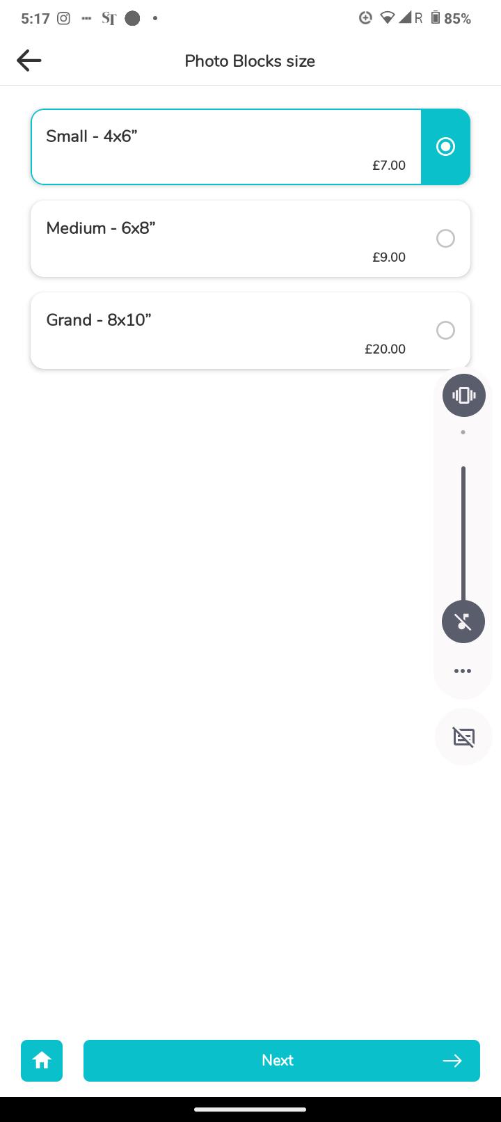
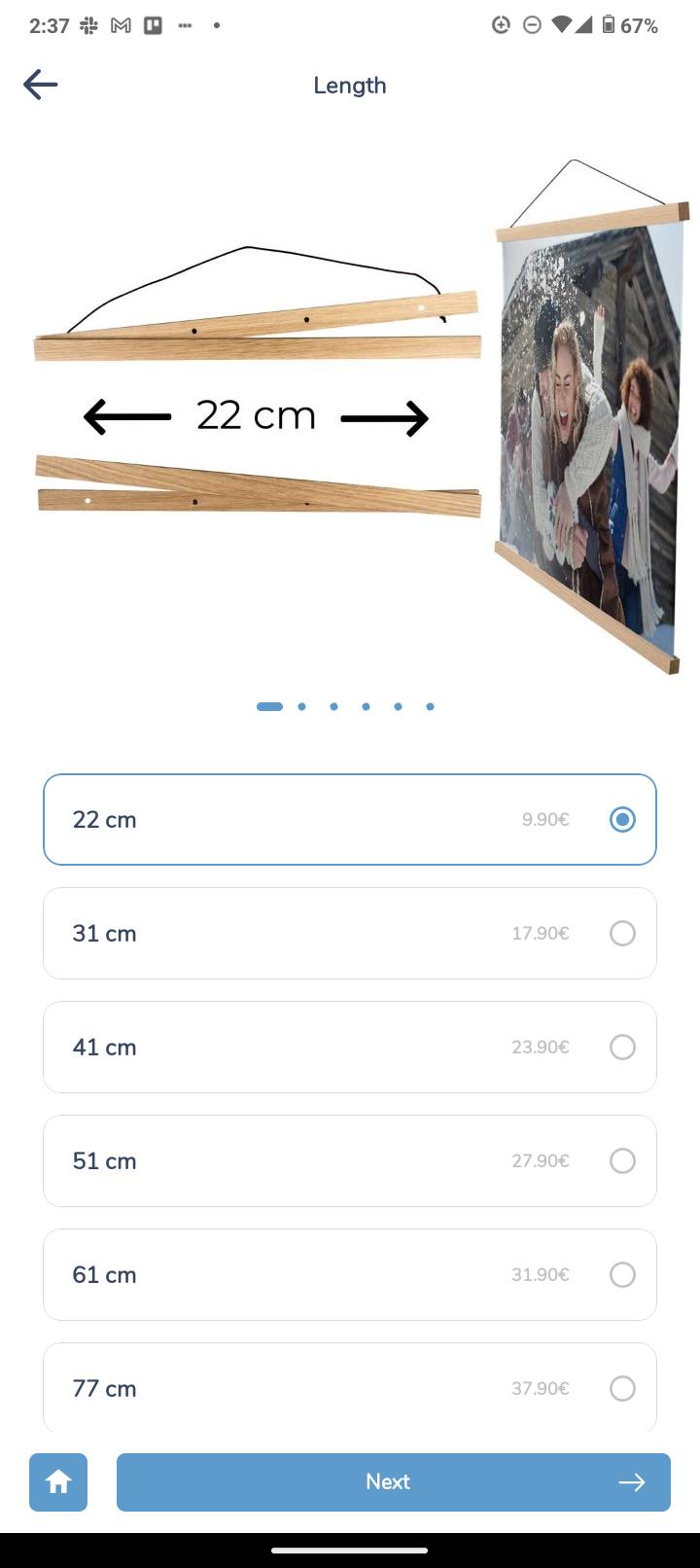
(late '23) When there is really no image to show, and a simple line of text suffices. (like indicating lengths of poster clasps)

Go to this tutorial dedicated to the 5 displayStyles and how to enable your white-label print app to switch to a single screen product selection flow.
multiCarouselLarge
multiCarouselMedium
multiCarouselSmall
multiRowOfThumbnails
multiRowOfTabs
multiRowOfPills
multiRowOfPillsWrapped
multiSwatch
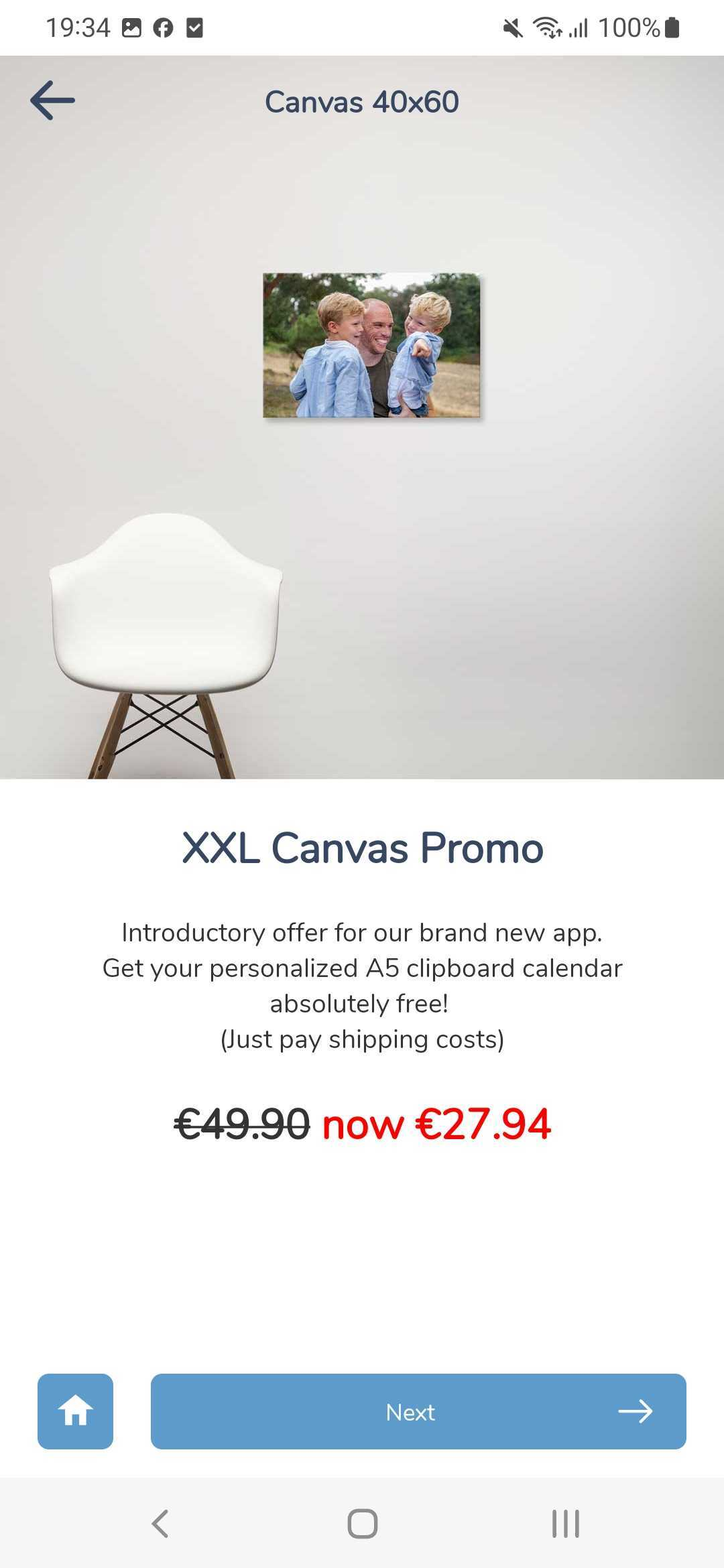
There is ONE perculiar situation where you will see this page on the right. This page is auto-created by the App in the situation where you have a Promo Banner linked to ONE single Product (read how to do that here) which is part of a multi-product category. (this is usually the case)
This product might usually be a listWithThumbnail amongst 10 other Wall Decor sizes. But featuring just a single listWithThumbnail will be ugly.
In this situation, the App will automatically create a Product Landing Page that is very similar to fullCarousel.
The Headline will be drawn from “description_en” and the body text is “meta-description_en“. The Price is as usual, defined by the attribute:price_en property.
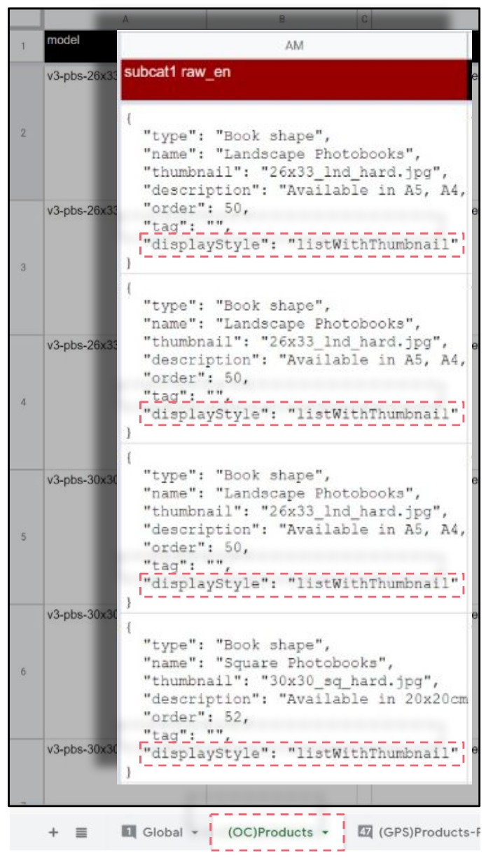
The attribute to look out for which defines this screen type is “displayStyle“.
Open the Official Configuration Sheet for your App.
Then find all the “attribute: subCat” columns. There should be about at least 3 sub-category columns. Most Apps will not use more than 3 sub-cats. Each sub-cat typically means one step in the product option selection process for your user, and we counsel using no more than 3 steps as far as possible.
Now look for the JSON tag “displayStyle” and replace it with the desired display style as written below.
Complete list of “displayStyle” (from v4 – Oct 2023)
Warning: enter them EXACTLY as shown above. All OC sheets should already have a drop-down list to choose from so you won’t make any typo mistakes.
swipe
fullCarousel
swipeVCentered
listWithHero
listWithHeroSqCardLessText
listWithHeroSqCardMoreText
listWithThumbnailFullHeight
listWithThumbnail
listWithTextOnly
! BE AWARE – You need to change the displayStyle attribute in ALL the products (rows) that show up on that screen (subcat) or else you will get unpredictable results on your app. Make sure you also read about how the subCat hierarchy works and how it defines the number of steps and product options your user will be presented with along the product selection flow.
photobook.ai uses AI to automatically create photobooks and other printable products. We provide white-labelled native mobile and progressive web apps to ecommerce and print suppliers. Through our network, we fulfill print products globally for clients who want to produce closest to their customers to reduce their carbon footprint and yet be competitive in their offering.