Type A: Page
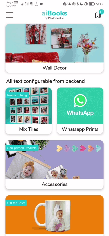
This is the first Category landing page we added (v3.0). This page appears immediately after the Home Screen. It has a carousel of images on top (half vertical height of screen) and a simple 3-style text area below that is scrollable.
It has several key features:
- Image Carousel is an added feature. You can set this to a single image which will give you a static page. The image area is half the height of the screen after removing the top status bar and the bottom Call to Action bar. This usually ends up looking like a square, but is not necessarily so. On a short iPhone SE screen, it is more like a 4:3 landscape image.
- Captions on each Image with a background half-transparent bar (colors are fixed by UI color scheme of app)
- Title and Sub-title text treatment, always center-aligned.
- Vertical scrollable center-aligned text body. This allows you to add as much text as you require and will also ensure short phones will not cut off your content.
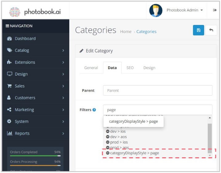
STEP 1:
Go to the target Category “Data” tab and find the “Filters” field and type “page” and you should find this filter listed:
categoryDisplayStyle>page
STEP 2:
To add text content which shows up in the bottom half of the page:
Title goes into the field “Meta Tag Title“
Body text goes into “Description” field. Type in all the text you want. Take note that they will be center-aligned , regardless of the text control settings in that field.
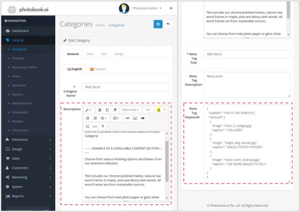
Adding the Image Carousel
To add an Image Carousel, look for the “Meta Tag Keywords” field at the bottom of the General tab and enter code that looks like this.
Type B: PageDrawer
The PageDrawer Category Landing Page is a recent (v4, Oct’23) advancement of the original Page design.
It has several additional features:
- Page Drawer pulls the text area up to 3-fifths of the screen height to partially obscure the image carousel.
- Page content has richer markups for content formatting, allowing the use of additional icons and 3-level text (Title, Subtitle and Paragraph).
- Additional content types within the page body, namely Icons
Preparing Icons: Depending on how many icons are in that row, the width of each icon will be shared equitably. So ideally, prepare square icons/images for the “icon” type.
					{
  "subtitle": "TEST",
  "carousel": [
    {
      "image": "Layflat-16x9.jpg",
      "caption": "I AM A CAPTION"
    },
    {
      "image": "paper_finish_glossy.jpg",
      "caption": "Set them up at..."
    },
    {
      "image": "Softcover-16x9.jpg",
      "caption": "Meta-tag Keywords"
    },
   {
      "video": "test-video2_EWPKSO1v.mp4",
      "image": "0099.jpg",
      "caption": "Short Videos OK!"
    }
  ]
}
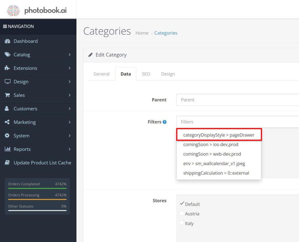
STEP 1:
Go to the target Category “Data” tab and find the “Filters” field and type “page” and you should find this filter listed:
categoryDisplayStyle>pageDrawer
STEP 2:
To add text content which shows up in the bottom half of the page:
You enter JSON code into the Description field. REMEMBER: that you must first set the Description box to <Code> mode. (see red box) Click that button, and you should see a black background console.
Enter the code as below, replacing your content accordingly.
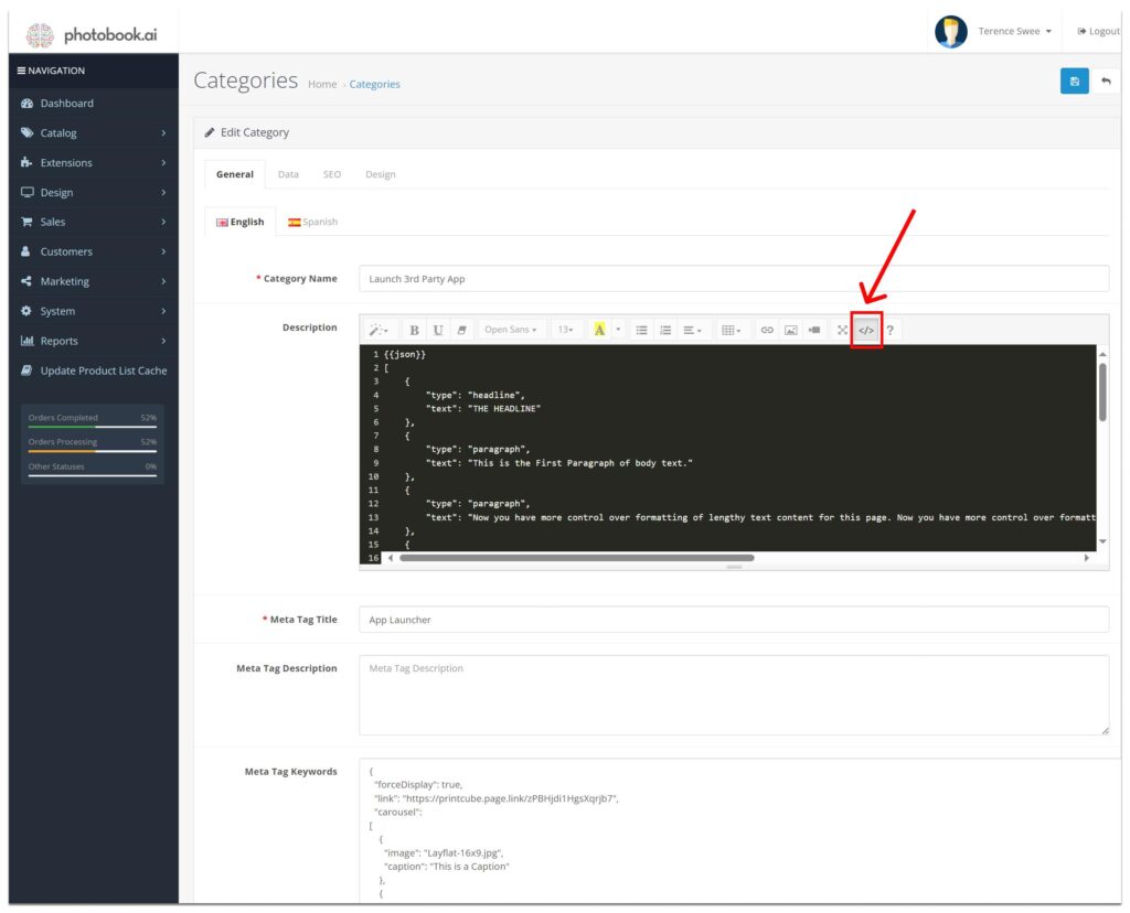
					{{json}}
[
	{
		"type": "headline",
		"text": "THE HEADLINE"
	},
	{
		"type": "paragraph",
		"text": "This is the First Paragraph of body text."
	},
	{
		"type": "paragraph",
		"text": "Now you have more control over formatting of lengthy text content for this page. Now you have more control over formatting of lengthy text content for this page. Now you have more control over formatting of lengthy text content for this page."
	},
	{
		"type": "paragraph",
		"text": "depending on the starting string `{{json}}`, it will parse a JSON, or use the HTML for parsing"
	},
	{
		"type": "icons",
		"maxPerRow": 3,
		"content": [
			{
				"image": "earth.png",
				"title": "Earth",
				"text": "The only planet not named after a god"
			},
			{
				"image": "moon.png",
				"title": "Moon",
				"text": "Temperatures from -153°C to 127°C"
			},
			{
				"image": "mars.png",
				"title": "Mars",
				"text": "Sunsets on Mars are blue"
			}
		]
	},
	{
		"type": "paragraph",
		"text": "This is another paragraph of text.  You may have as many as you need. More content types may be supported in future; currently only `headline`, `paragraph`, and `icons` are defined."
	}
]
Adding Image Carousel and Target Link Launcher
The process and code for adding an Image Carousel is similar to <Page> in Type 1 above. However, you now have an additional capability to add a target URL Link which you can use to launch an external webpage, or even an App.
					{
  "forceDisplay": true,
  "link": "https://printcube.page.link/zPBHjdi1HgsXqrjb7",
  "carousel":
[
    {
      "image": "Layflat-16x9.jpg",
      "caption": "This is a Caption"
    },
    {
      "image": "paper_finish_glossy.jpg",
      "caption": "Set them up at..."
    },
    {
      "image": "Softcover-16x9.jpg",
      "caption": "Meta-tag Keywords"
    },
    {
      "video": "test-video.mp4",
      "image": "0099.jpg",
      "caption": "Short Videos OK!"
    }
  ]
}