You will still require your PBAI team to eventually import your templates. From this tutorial, you will learn all the myriad ways you can implement creative photobook templates with our proprietary system and learn how to prepare your design and graphics for us to import and test it.
Photobook templates are complicated because you have to design for something which can change in dimensions and aspect ratios. This is because, with each few pages of paper, the entire width of the cover sheet enlarges in a single direction by a few millimetres (or even a hair’s breadth) which results in distortions in your intended design. As a photobook can range from 20 to upwards of 200 pages, the spine height can be an order of magniture taller.
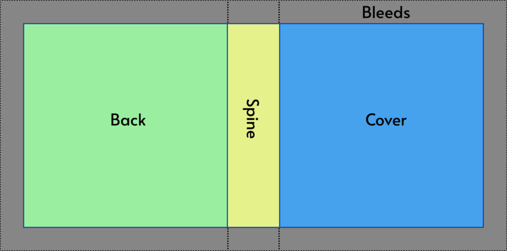
The Bleed area of a Hardcover photobook is usually significant as it is needed to fold over the cardboard backing of the book.
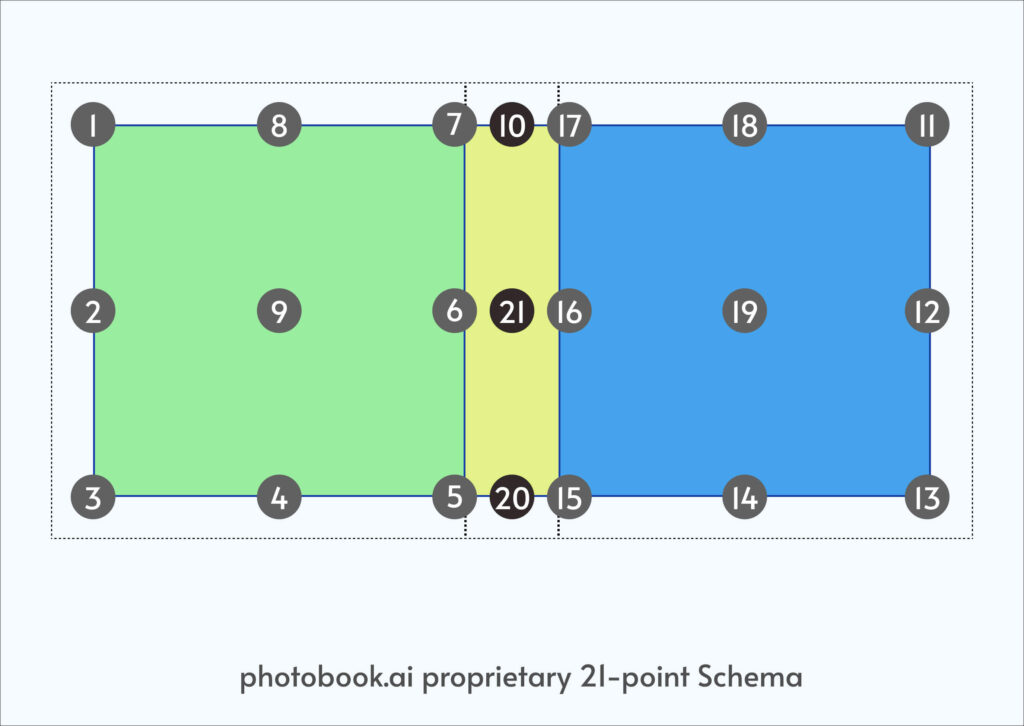
We have created our own 21-point schema to describe the topology of a photobook layout.
SURFACE MAP: We have segmented the surface into 3 boxes: the Back, Spine and Cover. Each box has a numbered sequence from the top-outer-most corner in an counter-clockwise (for Back) and clockwise (for Front) direction. This unique numbering results in each number and the +10 becomes lateral mirror opposites (1 & 11, 3 &13 etc) 10, 20, and 21 describes the center middle line of the spine box.
The Surface Map can be applied to a Book, a simple Print or even a Mug. Naturally, because of our roots in photobooks, it is over-specced when used to map out a simple surface like a polaroid print. Where there is no spine, then [7,10,17] or [6,21,16] or [5,20,15] are one and the same, and anchoring to either makes no difference visually.
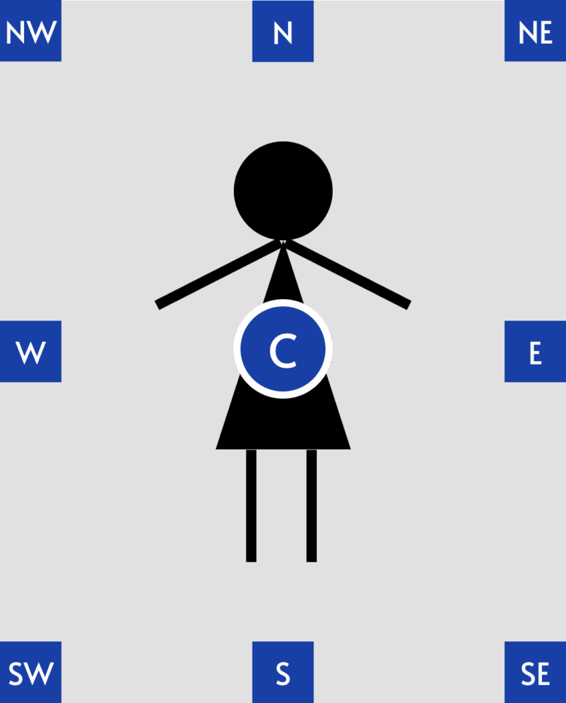
OBJECT MAP: the Object is what you want “pasted” onto the Surface. Anchors for an Object borrows the nomenclature of the compass, with an additional Center point. Binding anchors of an object to the surface then helps define the behavior of said objects when the scale and dimensions of the surface changes.
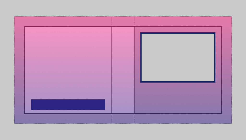
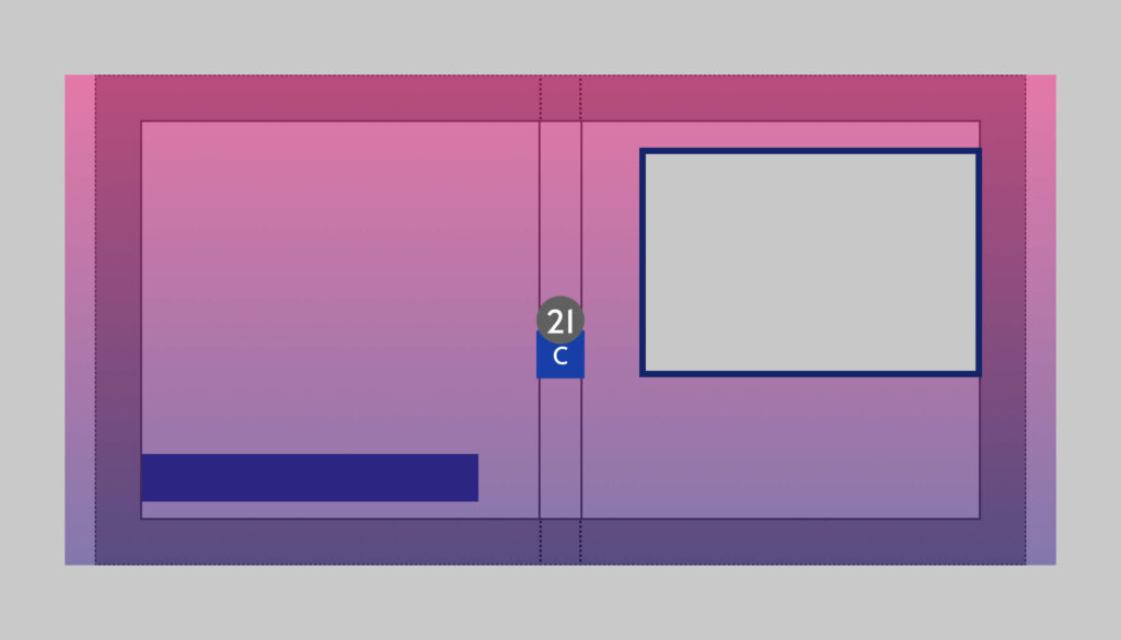
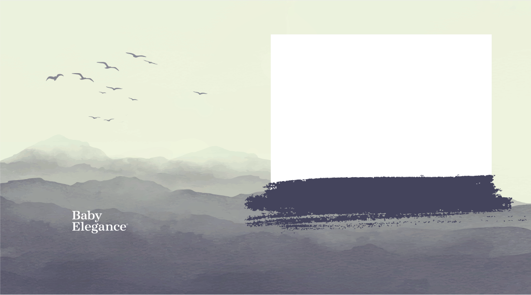
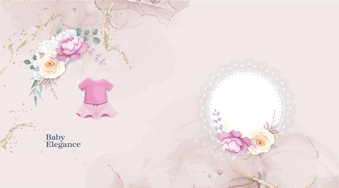
This cover design has a gradient background color. A window centered on the Cover for a photo. It also sports a box (usually a brand logo) centered, bottom fifth of the back.
We require graphics designed for the largest possible book (widest spine). We recommend you always have larger graphics prepared which goes beyond the crop lines and for the largest product you have. You can then easily size down and adjust for the smaller products.
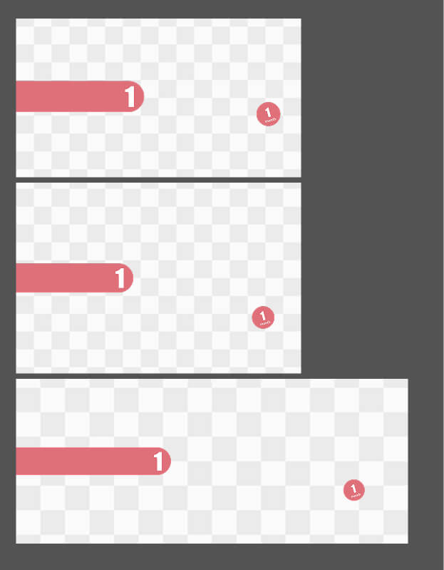
Let’s see what happens when you define different anchors to this product when the spine reduces to a third of the largest (like from a max of 120 pages to 20)
The natural tendency is to anchor C of Object (being the overlay graphic image) to the Anchor 21 of the Surface (book).
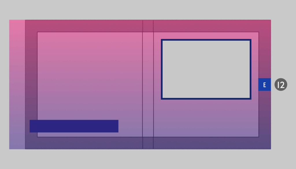
You will quickly see that the photo window is no longer centered when the spine reduces.
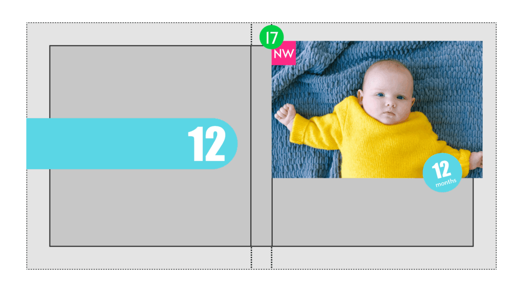
Anchoring E12 will ensure that your photo window is always centered to the cover however the spine shifts. HOWEVER you now have a problem if you absolutely need the rectangle at the back cover to be centered on the back as it would have shifted left (as the Surface is now slightly narrower than the Object).
The solution to this is to NOT flatten the logo element onto the cover graphic, but instead, save a PNG of it separately, then anchor the Center (or North or South) of the Logo object to 4 on Surface with the appropriate offset.
This gives you the most robustness to ensure proper positioning when the spine changes.
We would have prepared a FIGMA file with pre-configured frames customized to your product specs fixed to the largest possible spine which your production team has defined.
Ideally, prepare your graphics within Figma and within these guidelines. If you absolutely must design elsewhere, import each PNG into FIGMA and place them as you would want them to appear in your design before handing it to us for implementation.
Our engineers need to grab pixel measurements of specific objects to calculate the X, Y pixel offsets from the anchors.
You can then reuse objects (like logos and stickers) for the smaller books by using a scaling factor when we setup the template.
If you have books which are (say) Landscape A6, A5 and A4. Then just work on A4. The A-series are Root2 aspect ratios and scales perfectly in both directions. In fact, we do not even need to define a different template as the X, Y, Width, Height numbers will be exactly the same.
However, you may have books which are just ever slightly off. That’s not a problem. Within about 5-10% range, we can usually get away with not having a 2nd set of graphics. (of course, depending very much on the complexity of your design).
Measuring, configuring, then testing that the cover photo is always centered at exactly the same spot on every spine size is always time-consuming especially if they appear below an overlay with a transparent box/window. Any errors will result in ugly white edges around the photo. So try to reuse the same layout, but differentiate them by moving the Titles and Subtitles around, Left/Center/Right-justify the Titles, or add photo frames around the picture area.
Because fonts renders differently on front and backend systems, getting the Titles and Subtitles right is also time-consuming. So once you get it right, keep all/most of the templates with the same relative placement and line-spacing between them. This is a smart move we highly recommend.
Creating a design which requires the text elements to be vertically centered within a fixed bounded area (like a “sticker” or differing background color) is risky. It may look perfect for the default font indicated in the template, but because users are allowed to switch fonts in the app, some fonts may not work as well within that space. Of course, this is merely an advisory to avoid it, not that it is not permitted. Beautiful covers can be created with this effect.
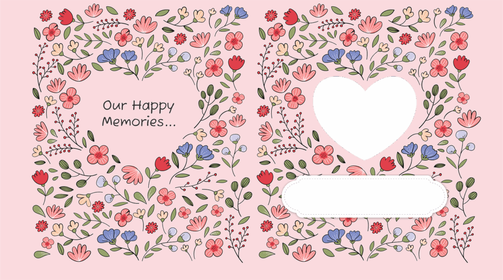
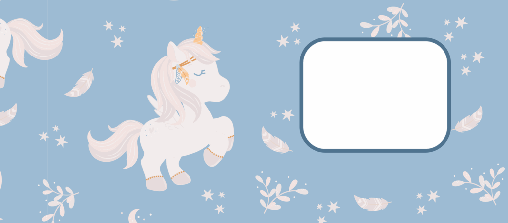
This beautiful design should ideally be for softcover books with no text on the spine and a small spine variance (so no layflats!) Else, the large heart space on the back will shift laterally and be visibly off-center.
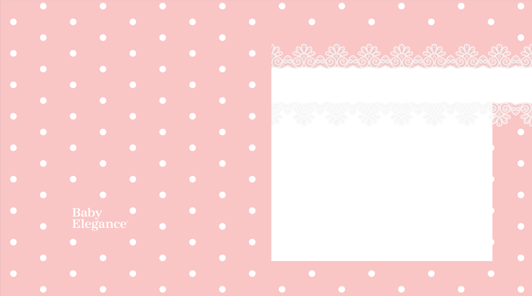
Placing a white backing “sticker” for the Title and Subtitle text constrains us to precisely place these text assets vertically centered for best results. This is unpredictable, since users can change fonts, and different fonts have different may sit lower/higher on the center line.
This is great example of a good design that is simple to implement and translatable to landscape and portrait sized books without much re-working.
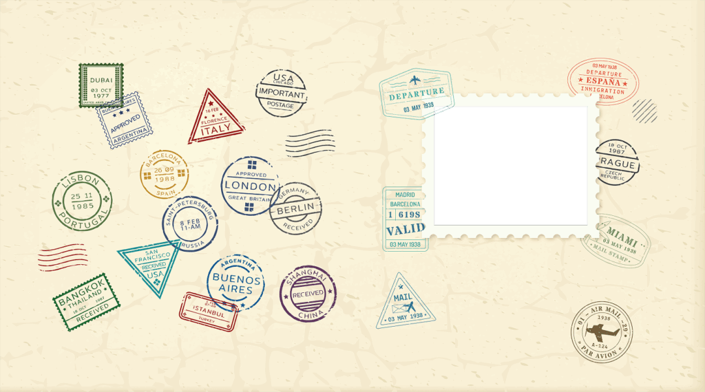
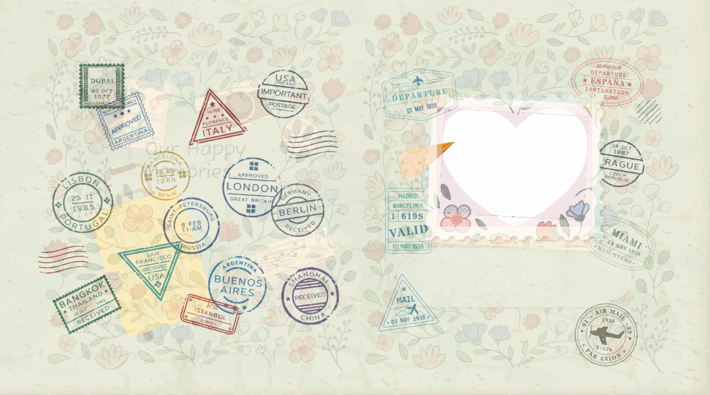
The space for Titles and Subtitles are also relatively fluid, and even if there is a long title, choosing a suitable color will ensure readability even if it clashes with some passport stamps.
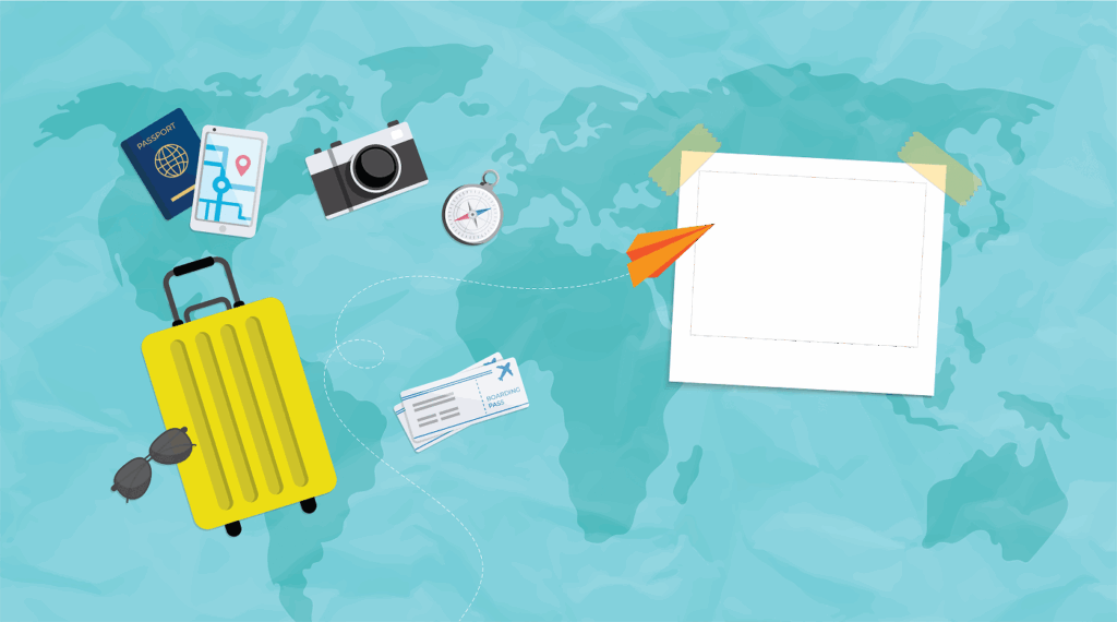
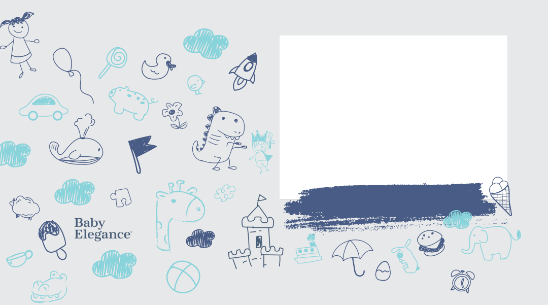
Another similar example to the above travel themed cover design. This is suitable for hardcovers as there is ample space on the spine. Also, even if the graphics on the back shifts laterally, they will not look “wrong” as there is no visible center elements, like the passport stamps above.
If you overlay all 3 designs above, you will see that the aperture for the cover photo is EXACTLY in the same exact X, Y, W, H placement. This helps reduce ALOT of time in setting up and testing of templates before releasing.
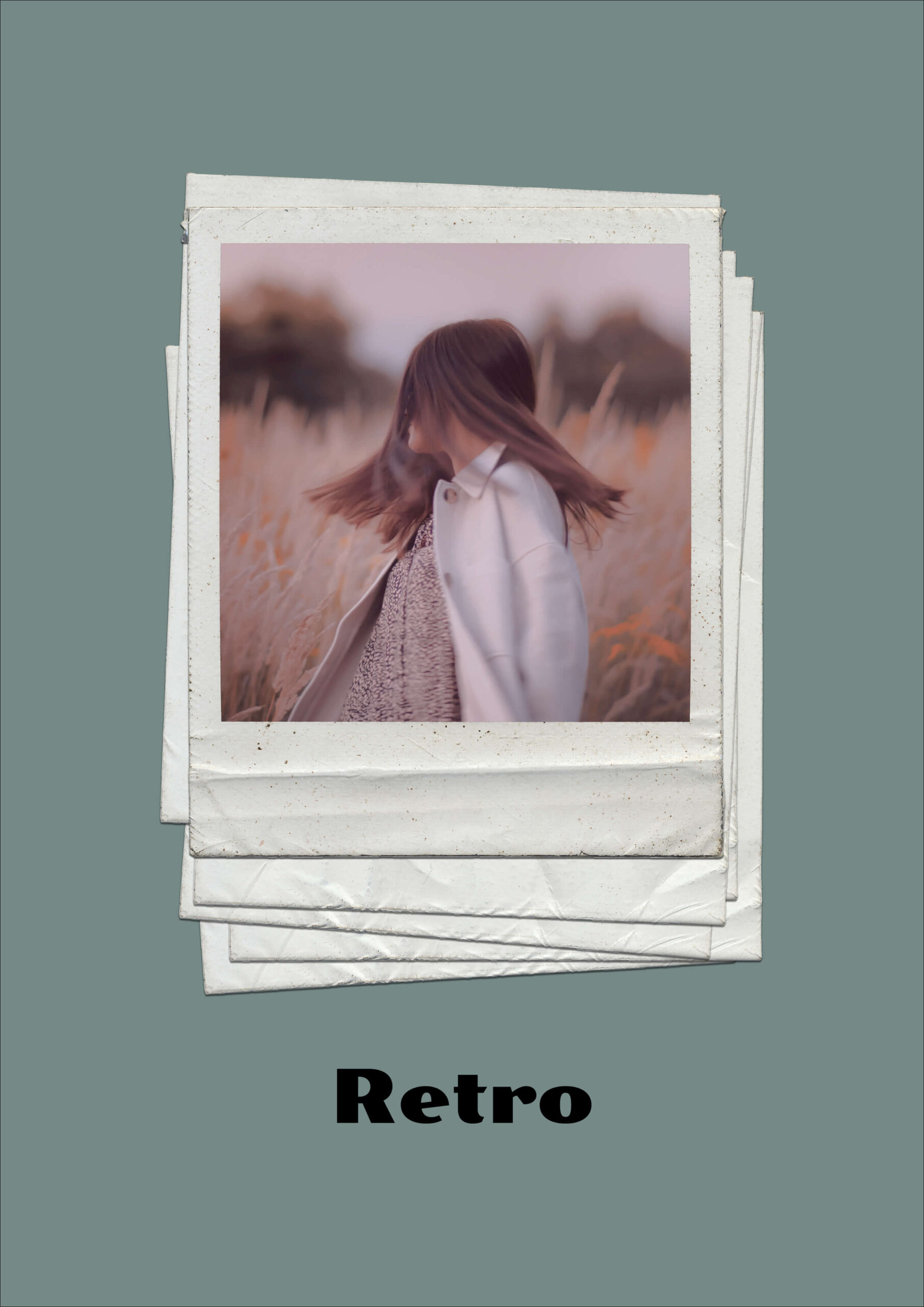
Our system does not yet support rotation of photos. So to simulate a slight tilt in the cover image (3rd template above), place a frame around it to cover the corners and ensure the photo is scaled large enough to fill the tilted rectangle.
These 3 samples shows what we need eventually delivered to us as PNGs, sized at 300dpi, for the same design in 3 aspect ratios.
This simple design is very versatile as you can easily use it in Portrait, Landscape and Square templates without even having to change the graphics (or only slightly if you’re a perfectionist) and the XYWH of the cover image remains exactly the same in all 3 aspect ratios. On top of this, the bonus is that the end user can simply change the background color of the Cover and arrive at very different looking photobooks. So one design, almost infinite results.
Set the photo to be W=0.5, Anchor NW17, offset the Y by -0.05 (to make sure it goes over the bleed a little so that it wraps around the edge, but we don’t “lose” too much of the cover photo to the fold-back).
This will work for Portrait, Landscape and Square books naturally with minor adjustments.
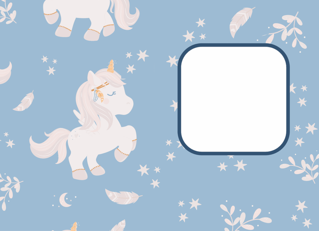
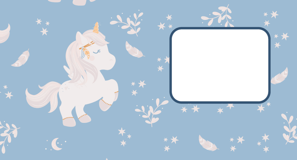
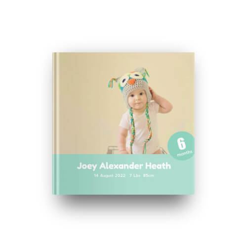
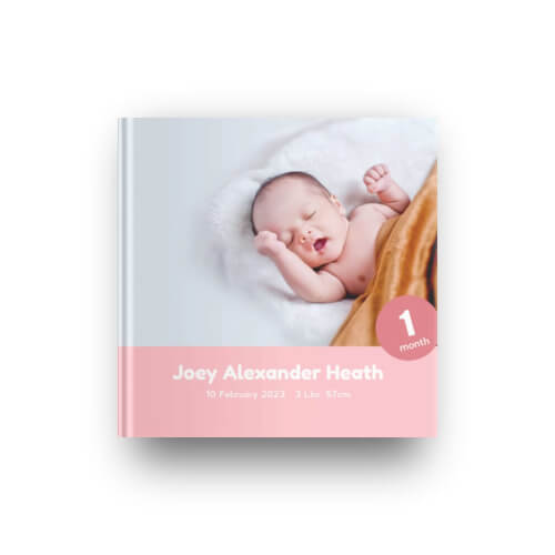
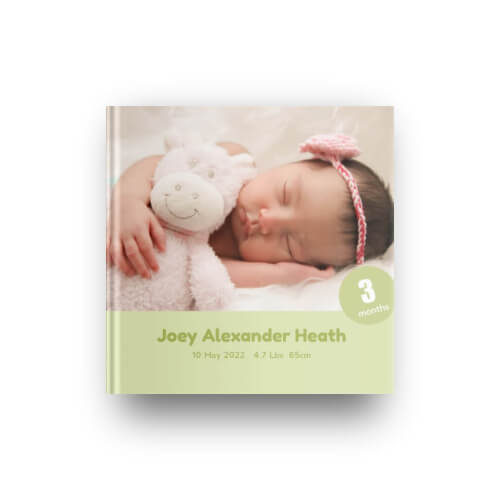
You can quickly create all 12 months of the baby’s age, set it up once and copy the values. And indicate a default background color, but user is able to change it in the editor to create variants. One simple design, infinite outcomes.
photobook.ai uses AI to automatically create photobooks and other printable products. We provide white-labelled native mobile and progressive web apps to ecommerce and print suppliers. Through our network, we fulfill print products globally for clients who want to produce closest to their customers to reduce their carbon footprint and yet be competitive in their offering.