New: Hybrid Home Screen style
If you are looking for instructions on preparing for the new Hybrid Home Screen, click here for the tutorial.
The Home Screen is where every user will start from. Let’s take a tour. There are two layout models for the Home Screen to choose from:
Hybrid (new: 2024)
This new refreshed design introduced just in time for the 2024 peak season features a large edge to edge promo banner space, with a combination of Vertical scrolling for the Top Categories and horizontal scroll bottom bar for secondary categories.
Vertical Scroll (2022)
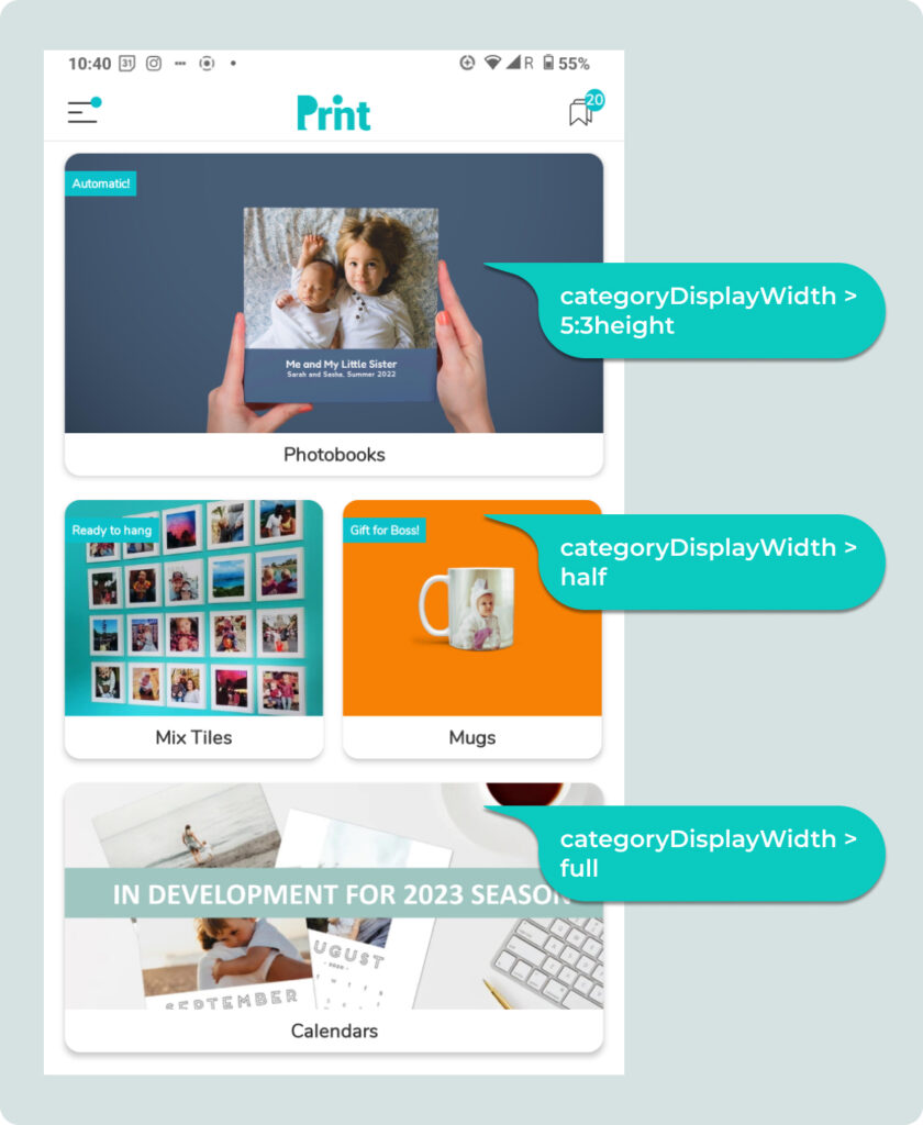
Product Category images scrolls vertically. This model also supports two widths of product category cards: Full Width (2:1 aspect ratio) and Half-width (1:1) where the card is half the width of the screen.
Horizontal Scroll (Deprecated)
Product Category images scroll sideways in two rows. They are about 7/8ths the width of the screen, and gets about 37% of the height of the screen. (This is deprecated in 2023 in favor of Vertical)
Promo Banner Row
All features an optional Promo Banner area on top. which scrolls sideways Hybrid gives you the largest promo space. Vertical and Horizontal (now deprecated) has a 3:1 slim promo banner space.
Text Divider Labels
The 3 Text Labels which titles the Promo banner, Row 1, and Row 2 are all optional and hot-swappable. The new 2024 Hybrid style dispenses with a label for the Promo Banner. If none are setup, then the space is reclaimed. In the slideshow on the right, you will see multiple examples of various white labels with no dividers, or just one divider.
Category Tile Sizes
From v4.0 (Oct’23) we have added one more home screen display size for Category images. The 5:3height. This now gives you 3 sizes for your Category cards.
Changing Home Screen Section Labels
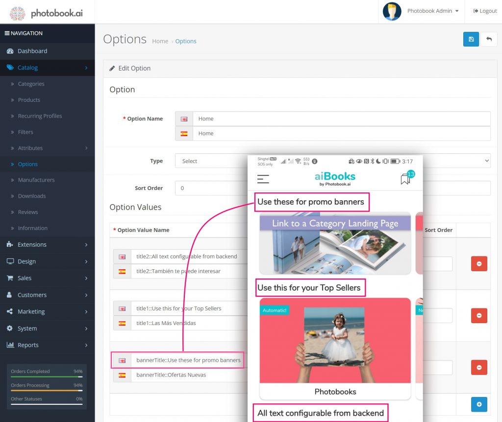
Step 1: Go to Catalog > Options > Home
You may see several items there. Look for Home and click the Edit icon. (blue pen icon on the right)

Step 2: Look for “Option Value Name”
Enter the Labels you want to use for each section in your Home Screen. You can only have 3 sections: One for the Promo Banners, and two labels for Product Categories.
How to add or change the "Ribbon" text label
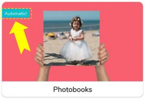
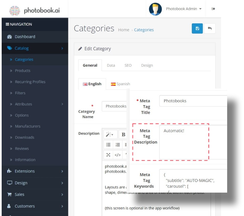
The Ribbon Text label is an optional call-out highlight element which can appear on any Category and Product image from the top left corner and is localizable for multi-language apps.
The ribbon background color, font and font colors are fixed by the White Label App color scheme and cannot be changed via the dashboard. Only the Label text can be edited.
To add this ribbon label on any Category or Product Image, look for the “Meta Tag Description” field in any Category or Product General setup page.
Warning: Watch for the number of characters used as this depends on device screen sizes, whether the Category is set to “half-width” if you are using a vertical scroll mode, and what image is being used.
How to define the Home Screen Style (Hybrid or Vertical)
Evolution of the Home Screen
Oct 2024: The HYBRID home screen style is progressively rolled out. (Filter Name: “hybrid”) Read all about it here.
June 2022: We released the VERTICAL scroll home screens to all V3 white-labels and made it the default for all new white-label apps. With the introduction of HYBRID in 2024, Vertical will still be supported as an alternative. This gives our partners more opportunities to differentiate their apps from our other clients.
V2 (Circa 2020): The HORIZONTAL scroll was the default and only home screen style. (Deprecated in 2023 in favor of the Vertical)
IMPT: Image requirements differ slightly between the 3 modes for obvious reasons. So after changing styles, make sure you check all your home screen images (Category and Banners) to make sure they fit. More info on image requirements here.
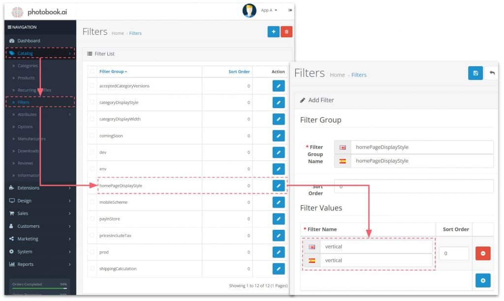
Go to Catalog–> Filters
Do NOT be confused by the Filters field in the Category screens (as below).
You should see a homePageDisplayStyle. If you do not, click the “+” symbol (top right) and add it yourself.
In the next screen (“Filters”), set it to “hybrid” or “horizontal” all lower-case. Again, if there are no filter names available yet, click “+” (blue icon bottom right) to add it.
Vertical Scroll: How to set some Categories to half-width
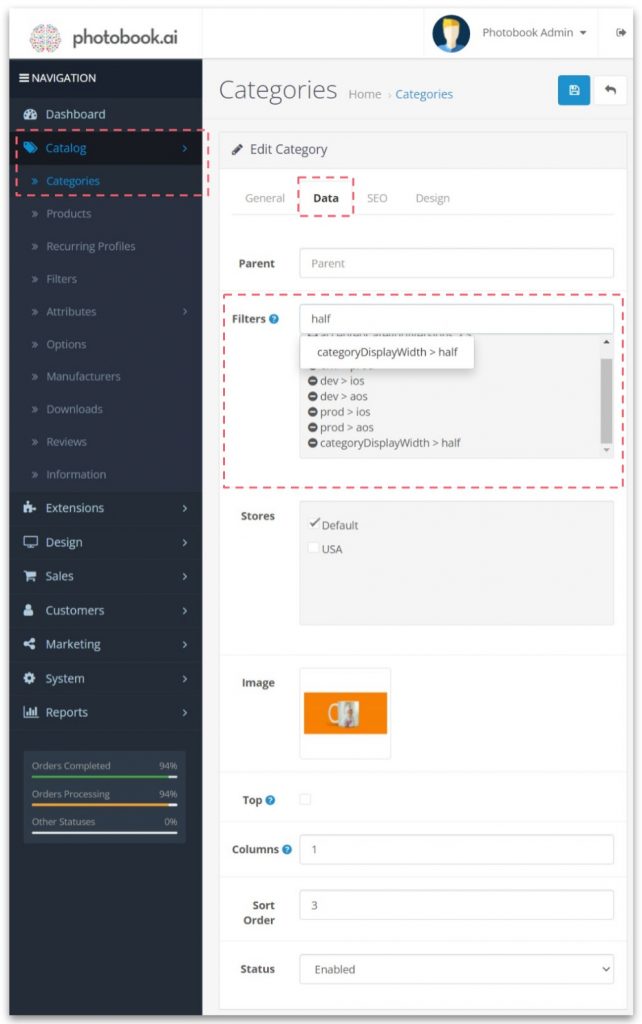
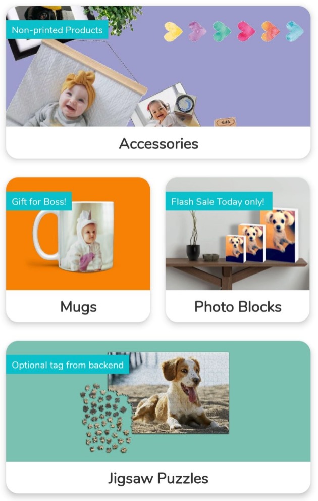
If your app uses the Vertical Scroll Home screen mode, then you can set up some Product Categories to take up half the width of the default Product Category image size. This is useful to segment more niche products and prevent too much vertical scrolling.
In your Category edit panel, look for “Filters” and type in “half” and you should find the filter “categoryDisplayWidth > half“
Warning: the next Category item must also be configured to be half-width, or you will end up with a blank space.

Horizontal Scroll: How to ensure a Category is on the Top Row
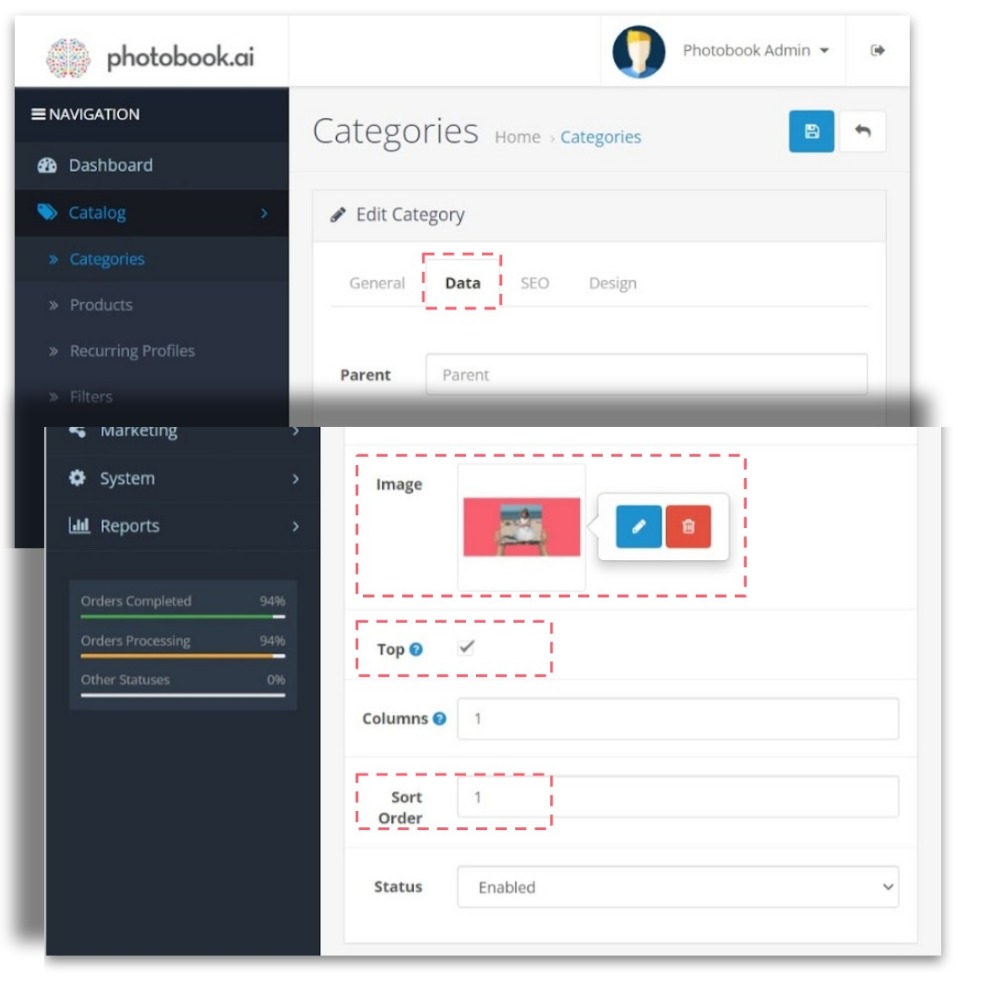
Go to Catalog > Categories and hit the Data tab.
From here, you can change out the Image for that Category, and check the box in the field “Top“.
To control the left to right positioning, set the Sort Order of this Category accordingly.
