How to prepare Product Images for various displayStyles
Images for mobile app GUI do not behave like web-responsive websites. To ensure your product images look their best on all types of phones and screen sizes and aspect ratios, you need to conform to these guidelines.
Dis-regard at your own risk!
TL/DR:
- Prepare Square images of at least 1000 x 1000 pixels
- Keep core content in the middle one-third of the square
- Deliver them in JPEG format (.jpg or .jpeg) and always put them through a web optimizer or minimizer. Ideally images should be of the order of few tens of kilobytes, or in the worst case, low hundreds of kb.
TIP: flat color backgrounds yields smaller files than a product in front of a lush forest or clouds)
If you are absolutely certain you will ever only need a landscape image:
- Make them 2:1 aspect ratio at 2000 x 1000px
- Keep core content in the middle 50% (you can use the entire span, but if this image ever gets cropped to a square, just know that content on the sides will be lost)
Because this is a mobile app you are beholden to the myriad of screen sizes and it’s various accoutrements like whether there is TouchID, FaceID, a notch on top (like Xiaomi), the new iPhone 14 Pro “Dynamic Island”, where the front camera is placed, and whether there is a physical of soft bottom center home button.
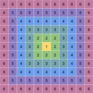
Image Guide
Additionally…
We recommend that the background color in the upper edge of your square image is suitable for dark colored text to be legible. Of course, the Title label may not always be critical to usability, and if you have compelling reason to use a particular image which may be dark, then go right ahead.
But the Title text CANNOT change color just for one screen, or for some sections of the app.
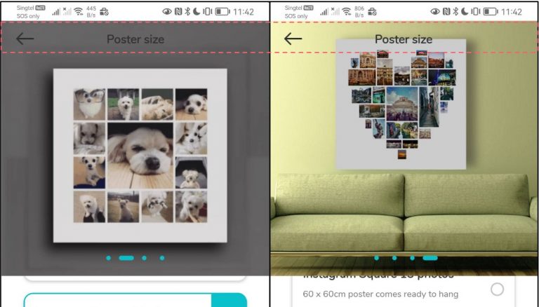
How the 11x11 Calibration Image look in various modes
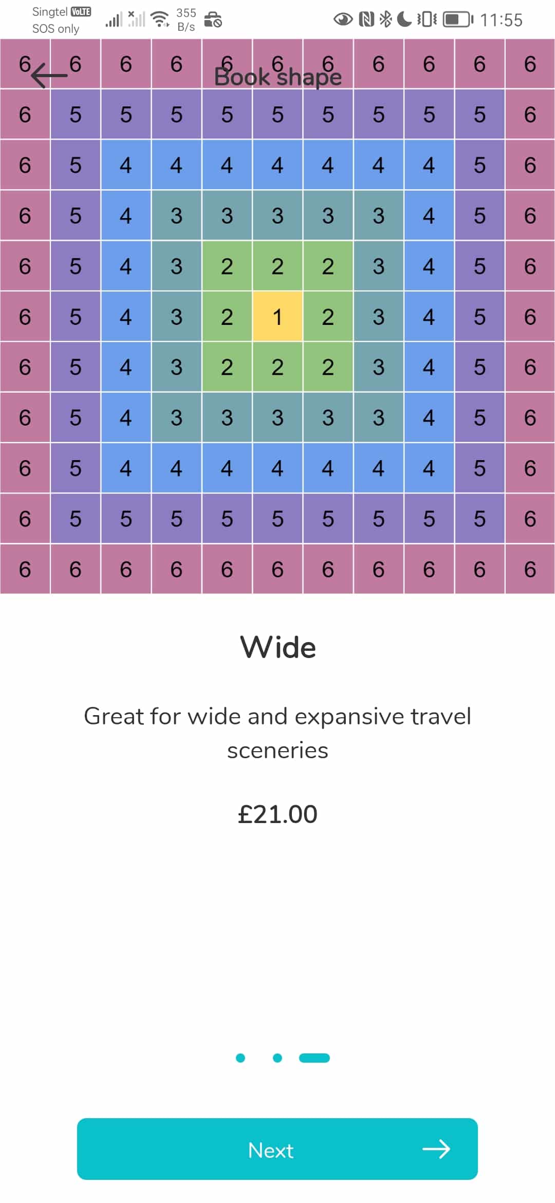
Full Carousel
This displayType ensures a full Square image. You can feel free to use entire space.
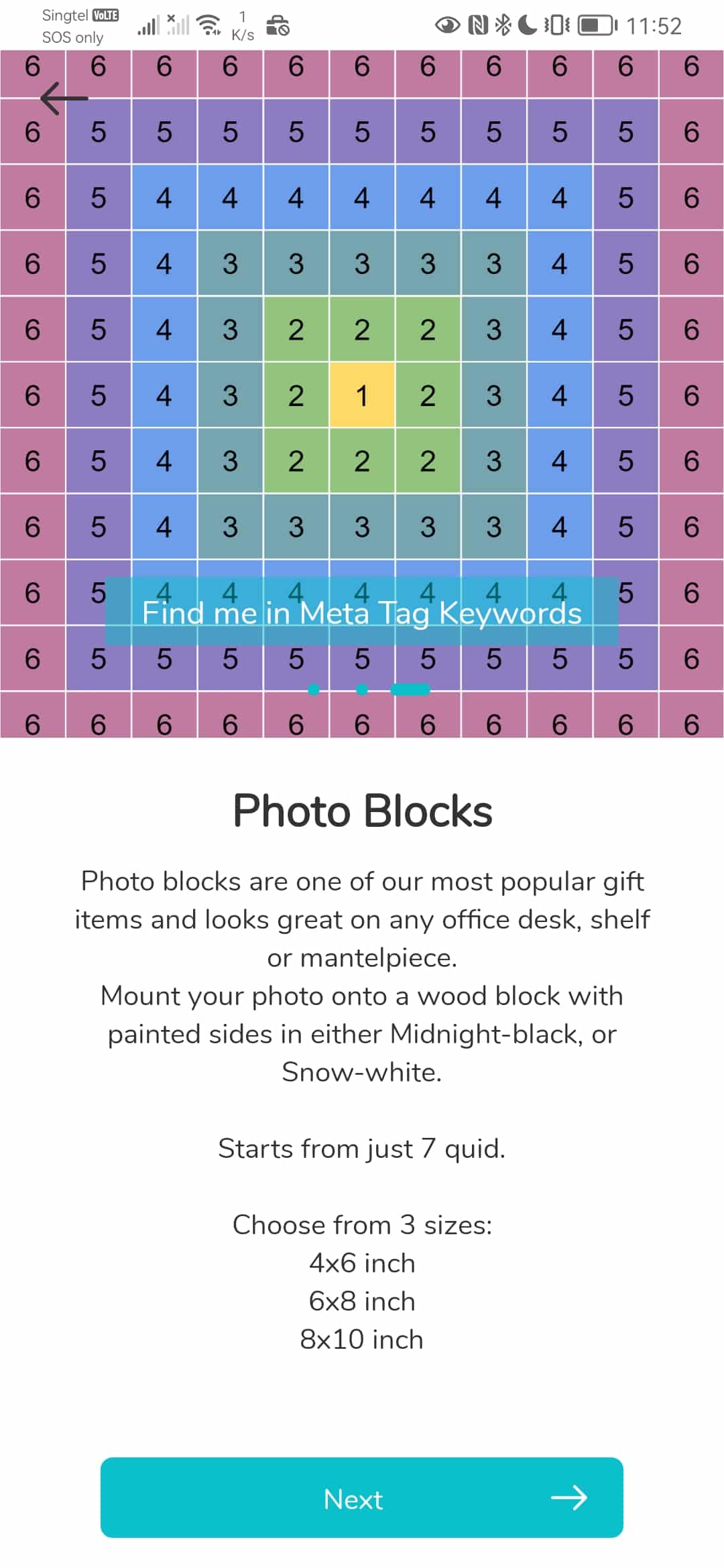
Category Page with Carousel
The available vertical height of the screen minus the CTA area below is divided equally by 2. This will usually get you an almost square image as most phones have a 21:9 screen.
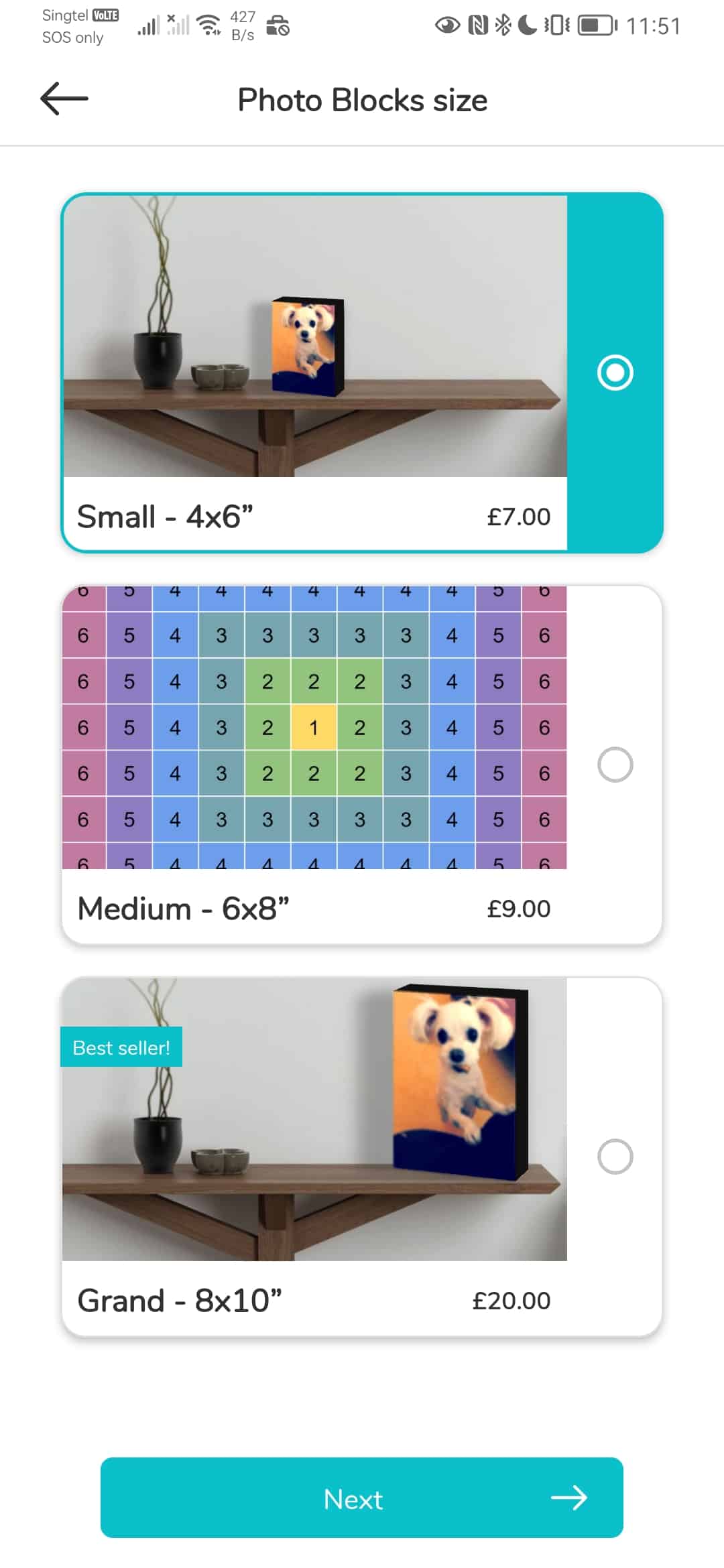
listWithHero
This is the only Landscape format product selection screen and this is set to be 2:1 aspect ratio. See how important it is to keep your content within the 3rd ring from center.
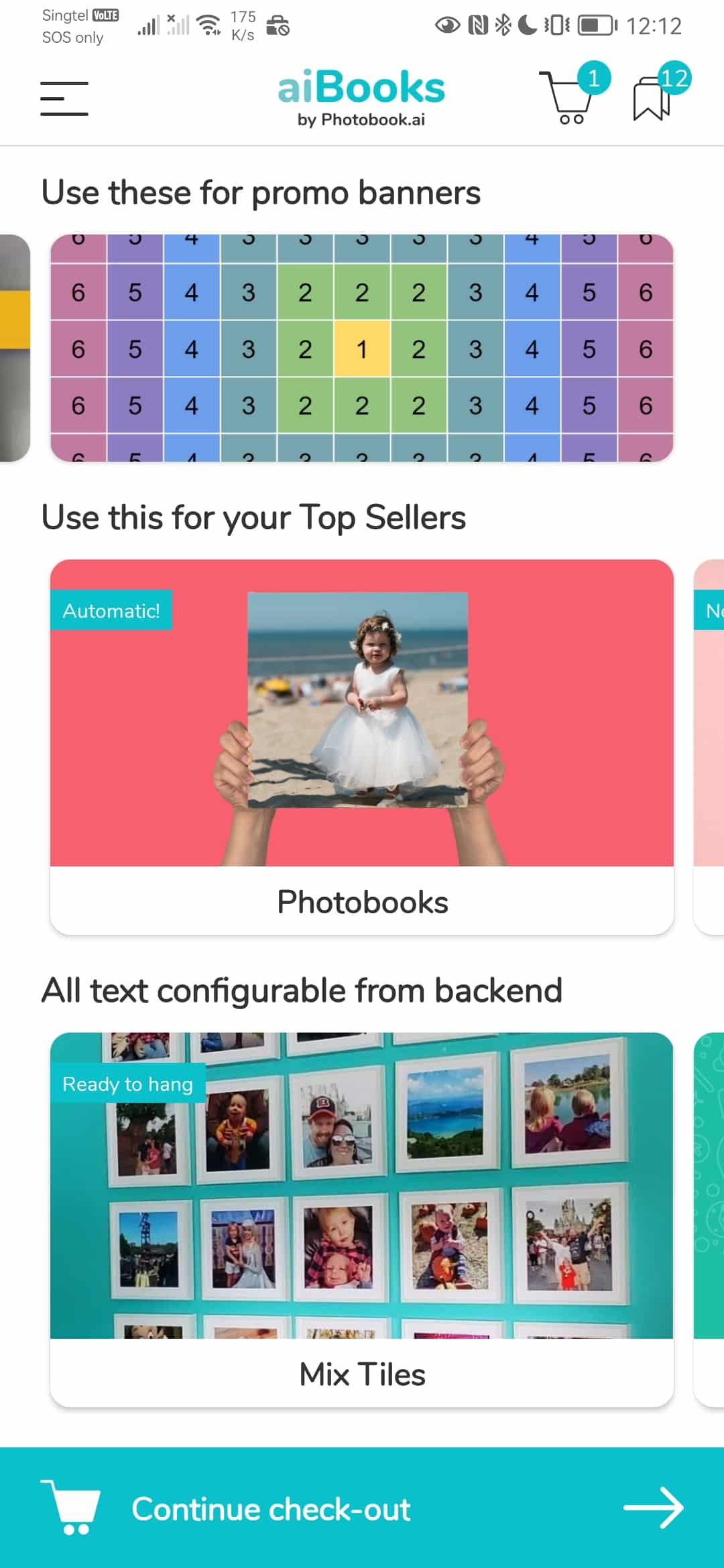
Promo Banner
Vertical Scroll Mode: Banners are 5:2 aspect ratio Horizontal Scroll Mode: the Banner is allocated 25% of the screen height. This typically gets you slightly larger than 2:1 (about 2.2:1 on most phones)
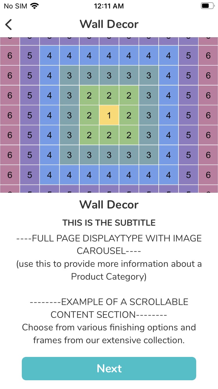
Swipe on iPhone SE
The iPhone SE 2022 is one of the shortest screen height at 1.77 aspect ratio. Hence half of this shorter height will give you a more landscape than square image.
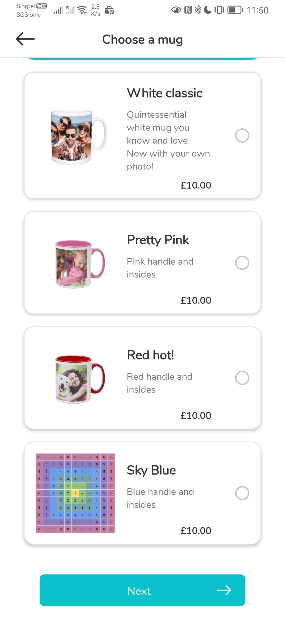
List with Thumbnail
This will give you an entire square, but if you are intending to use images for this format, then feel free to use the entire space!
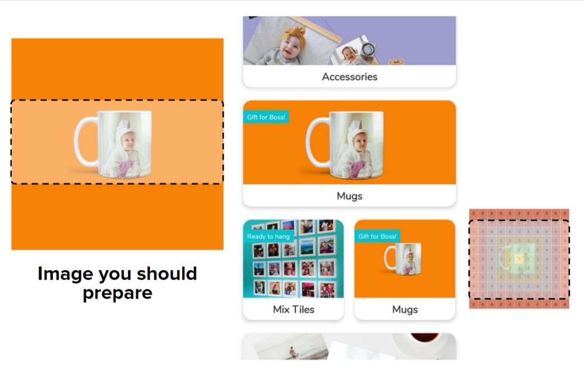
Preparing Home Screen Category Images
Home screen product shots are called Category images.
The guidelines are similar to product images above (1080 square, with core content in the middle 50% of space)
But for Category Images, because they can exist in both a very wide card and also in an almost square (for a half-width Category), the rule of keeping content in the middle vertical third of the square image is all the more important!
Preparing Promo Banner Images
VERTICAL MODE
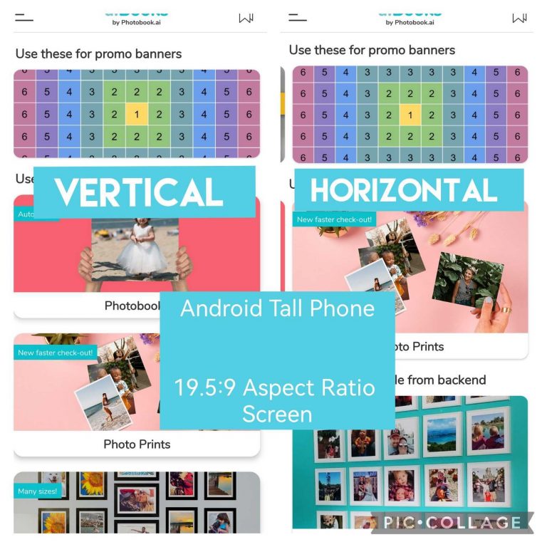
Banners are fixed to an aspect ratio of 5:2; so given most phone screen sizes are around 1080px in width, that means you should prepare an image that is 1080 x 432px.
HOWEVER, if you should expect to ever need to change your home screen layout to the Horizontal Mode in future, then you should cater for a taller image. (read on)
HORIZONTAL MODE
The top 25% of available screen height is for Promotional Banners, and the remainder 75% is split into 2 equal rows for the Categories. The promo banner will be slightly taller than 2.5:1 as you can see in the side-by-side comparison here on the same phone.
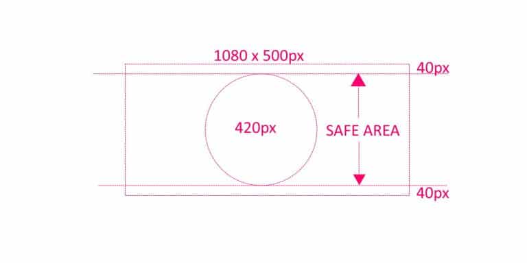
To ensure your banner works in all situations and screen sizes, prepare them as below:
1080 x 500px with a 40px vertical safety margin
How to cheat the system?
The App fills the prescribed space in the user interface of THAT particular phone by filling the longest sides first, without leaving any blank space. And because phone screens comes in all aspect ratios, we recommend you prepare square images with your key content in the middle 50% (horizontally and vertically).
HOWEVER, sometimes your core product is Tall (or wide) and this could result in “wasted space”. So in this cheat-sheet, by understanding how it reacts to different space, you may optimize your product images for the shape of the product you want to sell.
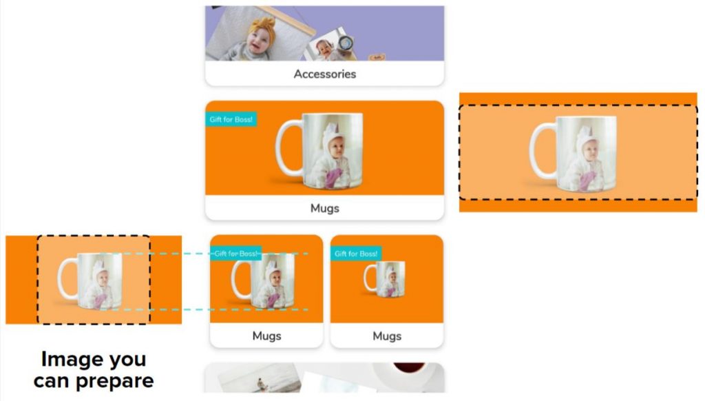
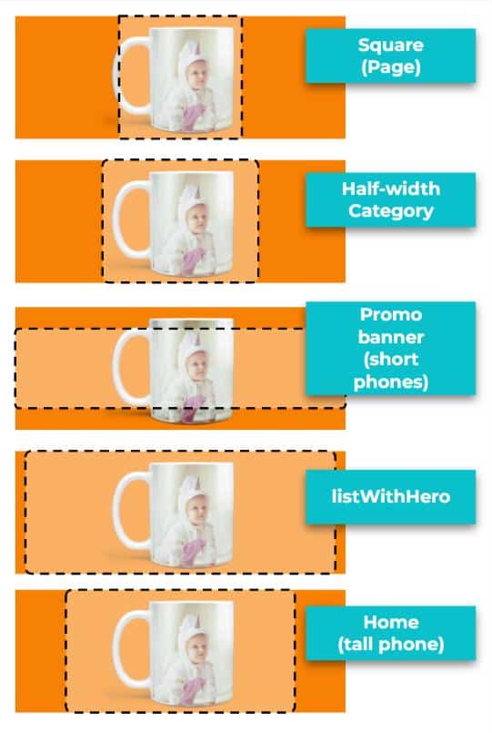
In the example of the mug (a relatively square product), by creating an image which is 2:1 gives you a larger mug on the half-width Category variant (than if the image were a square). However, part of your mug will just about fall outside of the crop for a fullPage displayStyle which is a perfect square. (first example on the top right).
It will also get cropped when used as a Promo Banner (3rd example).
Now that you know the rules, you can break them! But if you are briefing a junior designer, stick with “Square+Middle”.

