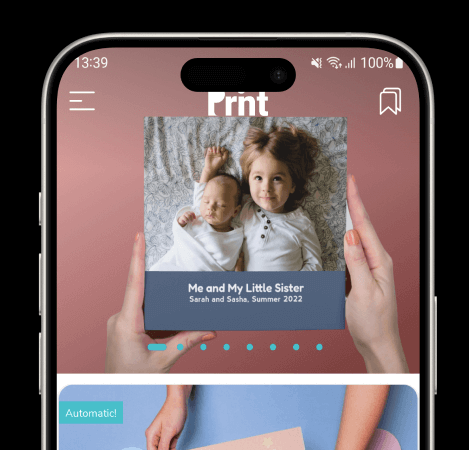
The new HYBRID Home Screen is a response to feedback from both users and white-label partners. It features front and center, a large 11:9 banner space, taking up the entire space, reducing wasted white space between them unlike the Vertical and Horizontal display styles.
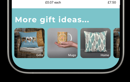
This new design is best for stores which have many categories of products on the home screen. It allows you to declutter, feature the top sellers, and push the less-frequently featured categories to a horizontal sliding bar at the bottom. It is also very flexible in that you can have ALL your categories be on top, and dispense with the bottom horizontal scroll bar.
Promo Banners
Promotional banners are now 11:9 large (almost square), reaches all the way to the top edge of the screen and scrolls horizontally. It also features tab indicators to signal to users there are more to be seen, inviting them to instinctively scroll sideways.
Top Categories
The Top Categories in this section scroll vertically infinitely. The full-width cards remain available in two heights: 5:3 and the default 2:1 One notable new feature is that the lowest price of the products within that Category will now show on the card.
Half-width Top Category Cards
Just like in Vertical home screen style, Categories can also be half-width. (same setting) But the category label and price will now be outside the image area if it's a half-width.
Secondary Categories
NEW: we now have a horizontal scrolling bar right at the bottom of the list of top category cards. These will just have the label superimposed on the cards, without a price. They are a useful feature to showcase all the other categories of products without cluttering your home screen, or making it an endless scroll.

Preparing the Promo banner images
With this new HYBRID mode, you need to observe a few guidelines for best visual effect.
Size: 1100 x 900 px (or any size that is 11:9 aspect ratio but we recommend at least 1000 px wide). If you provide something that is taller, the app will fill the 11:9 space and crop top and bottom.
Top 15%: Make sure your design allows for the white icons to show. We already apply a slight dark vignette to ensure that, but having a busy design, or something that is bright white wil not work well.
Bottom 10%: If you intend to have multiple promo banners in this slideshow, there will be tab indicators in the primary brand color. Make sure your design allows these dots and colors to work well visually.

Guidelines for Secondary Categories
Image size: 400 x 400 (anything that is 1:1)
Category Label: Keep it short! If you give it a long name, it will wrap into two lines, keeping it right-aligned.
Setting to the HYBRID display style

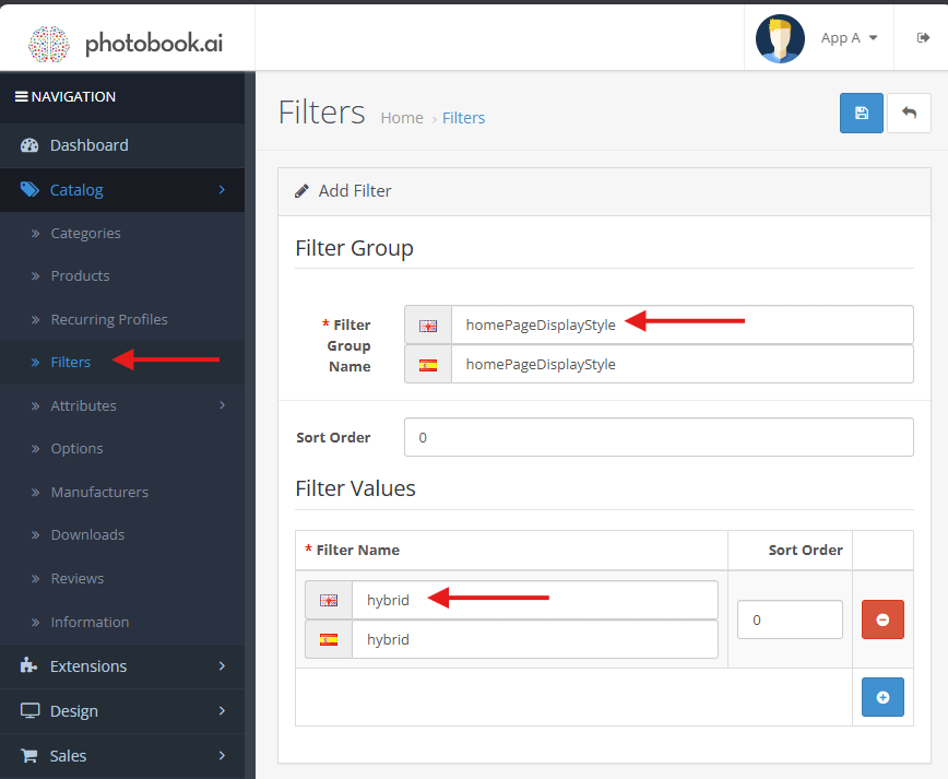
Go to Catalog–> Filters
- Do NOT be confused by the Filters field in the Category screens (as below).
- You should see a homePageDisplayStyle.
- If you do not, click the “+” symbol (top right) and add it yourself.
- In the next screen (“Filters”), set it to “hybrid”. If there are no filter names available yet, click “+” (blue icon bottom right) to add it.
How to place Categories in the Vertical scroll section
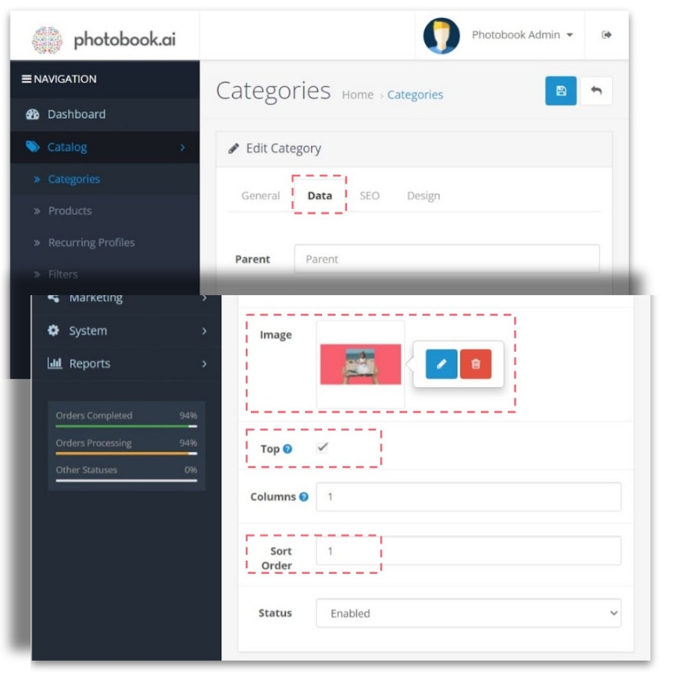
Go to Catalog > Categories and hit the Data tab.
Check the box in the field “Top“.
To control the Top-down positioning, set the Sort Order of this Category accordingly. If you have half-width Categories, make sure they come sorted in pairs.


