


The 8 Elements that make up a Book Template. 5 on the cover, 3 for the inner pages.
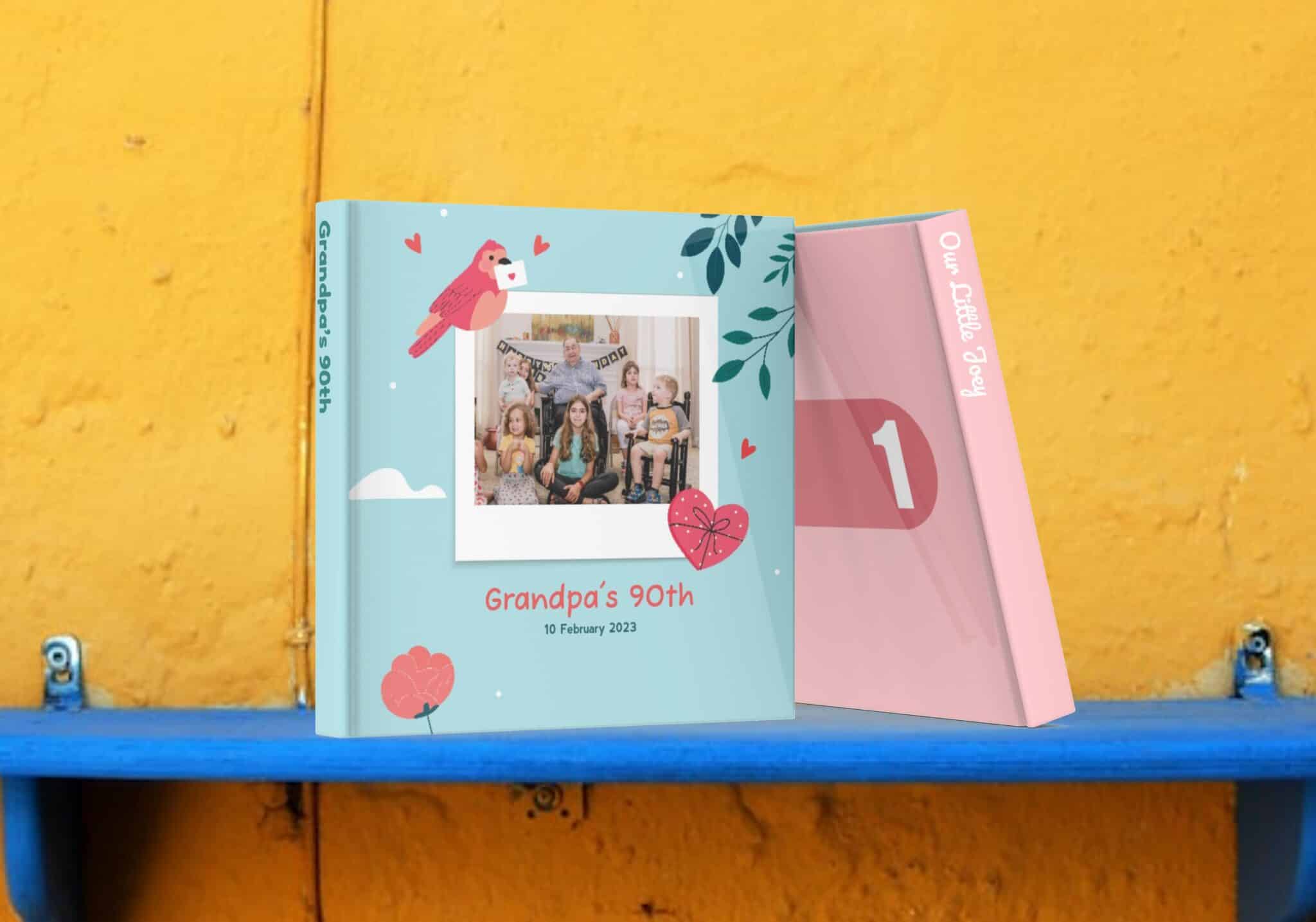
Graphic Asset: This is the background graphic. In this example, it’s the entire PNG with an empty transparent box where the user’s photo will show through.
Title: (“Granpa’s 90th”) To add a Title, you will define a Text Box area, then define the recommended Font and color for the Titles. The actual text that users enter for Titles will be used in the Spine. Note that the user may change this font in the Cover edit screen. More about fonts and their idiosyncrasies later. Titles are also the Project Name in our WebApp and hence compulsory in any project.
Subtitle: (“10 February 2023”) The same properties present in Titles are also supported, but typically a smaller text box is allocated (but it does not have to be so). Subtitles are optional in the Mobile app (you may define it, but users can get away with not entering any text. Titles, however are compulsory if they are defined)
Spine Text: (at this time) We do not provide a separate text entry for users to enter a different sentence to be printed on the Spine . By default, we will print the Title on the Spine (for all non-softcover books). You can, however, define a different Font and Font Color for your Spine. You can also define its alignment (Left/Center/Right). Note: the recommended rotation of Spine text is to be naturally readable when the book is laid on a table with cover facing up. Because we also support Left to Right books (for our Hebrew and Arabic user base) this is an important detail!
Page Elements: Page Elements can be a simple color fill (HEX code) or a complex graphic element. You can define as many page elements as you want in a template. It supports a Strategy and Cycle property which determines on which pages it appears and how they repeat and cycle. We will dwelve more into this later.
Page Captions: these are the text mentions on each page. (in Layflat mode, there is only one caption per spread) You can only define a single font and color for all pages. These are optional and the page layout creates space for the Captions only if users adds them.
Tip! All 3 cover text elements (Title, Subtitle, Spine) can have their own Font, Color, Alignment and Rotation (and box positions) and they can also be different for inner page captions.
For each Book size, you will be given a template in Figma. You can also use Adobe Photoshop/Illustrator etc.
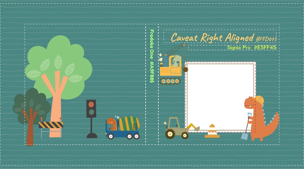
At this time, the Cover only supports a single Graphical element. So lay out all your stamps, stickers and frames and background textures as you wish and then export them as a single flattened PNG with a transparent empty box for where the user’s cover photo will appear. Make sure the background textures well covers the fold over (for hard cover and layflat books) and the bleeds right through the edge of the book.
If you are going to have Spine text, make sure the color you choose for Spine text has enough contrast from graphics in the area around the Spine.
For the Titles and Subtitles, indicate:
Spine text are auto-calculated and based on the Title box and physical spine dimension.
For our native mobile apps, there are THREE lists of Fonts available for use in the App, totaling 35 to choose from. Designers are encouraged to only choose from the Public and Private Lists as we intend to eventually retire the Legacy List.
For WebApp-PWA: Unlike in our native mobile apps where we are able to load fonts, if you are designing templates for our WebApp, you are required to use Google-fonts.
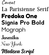
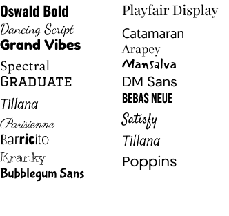
These are the 9 Fonts that users will see in our Native white label apps for English script. Special non latin language versions will have a custom list with a few of these swapped out to support those langauges. (eg: Greek, Japanese, Chinese, Korean)
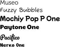
These are typically fancier display fonts suitable for Titles which are indicated by Book Templates (but are not made available in the Public List for app users to choose from). We do add to this list upon request (for example for Halloween or an Oriental Wedding). We expect to review and cull this list periodically as they make the app download larger.
These are fonts that were installed in our older iOS and Android apps and we kept them to ensure older Cover Templates will still work. We will gradually retire them, or move them to the Private List in 2024. AVOID choosing fonts from this list for your Template designs.
Public List
Caveat 400
La Parisienne (NOT “Parisienne”)
Fredoka One
Signia Pro 700
Mograph
Jasmika
New York Font
Holiday Trip
Madison Script
Private List
Museo
Fuzz Bubbles (400 & 700)
Mochiy Pop P One
Payton
Pacifico
Nerko One
Legacy List – iOS
Legacy List – Android:
Typography is an entire art and science of its own which we don’t have enough space on this post to indulge. So we bring to your attention the few potential unpredictability of how Fonts in the digital space appears.
We present two examples where we have the EXACT same font size in the EXACT same text box, with the EXACT same vertical alignments set to align bottom. Even then, you can easily see with the naked eye that some fonts sits higher than others.
So when you design and place your Title and Subtitle boxes, be cognizant that users can and will change fonts, regardless of what you indicate in your Template. So make sure there are enough padding all around. Your design should be “forgiving” that way. Expect that some Titles will sit higher with top extenders reaching farther up and lower extenders reaching farther down (potentially conflicting with the top extenders of the subtitles below).
So always test using “tall” characters like Uppercase W, I, P, T in the subtitle text box sitting below the title box containing many characters with descenders like lowercase y, g, q, z. And see if the Cap of one touches the tail of the other in a worst-case scenario.
For this same reason, we have eschewed a user interface where we provide a text box and a character limit as it is highly unpredictable. Some of these fonts will appear slightly different in iOS versus Android, versus when rendered in different browsers (Edge, Chrome, Firefox, Safari) when using our WebApps. Here are a few egregious examples.
For this reason, the User Interface for entering text is to enter them directly onto the book in a WYSIWYG text box. In the examples above, same sentence, same font, but due to having more W and M’s, there is a 9 character difference. (25%). Now with the same sentence, different font, we can accommodate 51 characters, a 42% bump up in character limit!
For the same reason, we also render all text elements on the device itself, which then gets uploaded to the cloud along with the photos to be finally flattened and rendered onto a printable PDF. This ensures WYSIWYG integrity all the way from Pixel (user’s screen) to PDF (printable file) to Print (the actual physical book received). We call this our 3P Promise.
Inner pages can have a flat plain HEX color code, or an entire background graphic or texture. You can define as many different graphics as you like for your template, but they do make the template heavier to download!
You can also have illustrations/stickers appearing every Nth page starting from the P’th page, by setting the Strategy and Cycle properties. (subject of another tutorial in future)
You can also define a Font and Color for inner page captions. Do choose a font color that will stand out from the page background color you set (or background graphics).
The size and position of the Captions box is decided by the layout algorithms, and it depends on the photos on the page and the layout calculations.
photobook.ai uses AI to automatically create photobooks and other printable products. We provide white-labelled app-to-print native apps and progressive web-apps. Our white-label platforms run globally in over 20 markets, doing thousands of orders each day.
© 2024 photobook.ai