

This feature is rolled out since Q1-2026 to all native app white-label operators. This enables you to zip through product selection in a single step, rather than a wizard step-by-step experience.
This is useful for highly customizable SKUs where you may offer >3 attributes which are customizable. It also gives you options to use simply text for easily understood attributes (like dimensions) which do not require images.
Naturally, some product options may require a larger image, so this system caters for that with 4 displayStyles which support varying sizes of images.
Naturally, when you enabled this mode, it means all the products within that ENTIRE category will use this UX, instead of the more traditional wizard driven multi-screen step through flow.
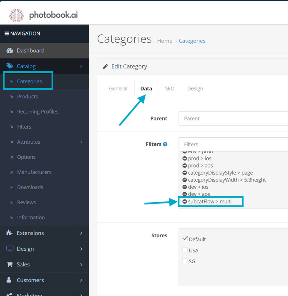
To make a category display multiple subCategory attributes in a single screen, first add the filter to the Category.
In other tutorials on how to write display styles JSON, you are already familiar with something like this below. There are 8 displayStyles which are part of the family to define display styles within the subCatFlow>multi mode. All of them are prefixed with multi.
{
"type":"Choose a theme...",
"name":"Mother's Day",
"thumbnail":"",
"description":"",
"order":100,
"tag":"",
"displayStyle":"multiRowOfPillsWrapped"
} multiRowOfPillsWrapped
multiRowOfPills
multiRowOfTabs
multiSwatch
multiCarouselLarge
multiCarouselMedium
multiCarouselSmall
multiRowOfThumbnails
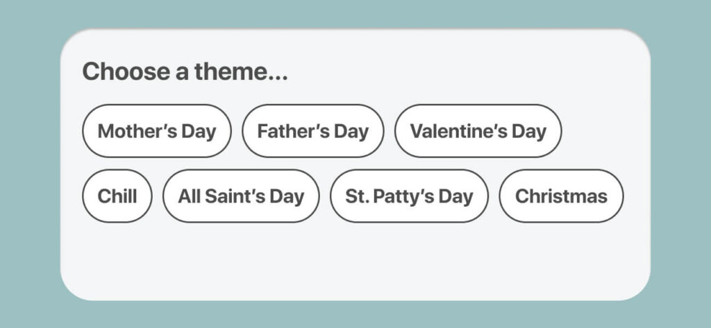
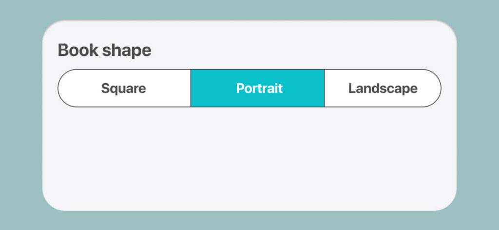
Simply text-only name pills. You can have as many as you want and they auto-wrap. Descriptions will be ignored.
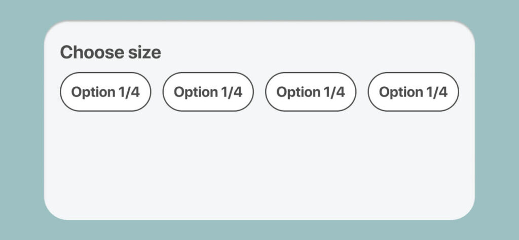
This is a constrained version of PillsWrapped which fits all into a single row and concatenantes the labels if there is shortage of space. For clients with multi-language, you need to check that the translated names will fit.
Tabbed design useful as the first root property. Only use this if there are no more than 3 with short labels.
Tapped design, useful typically as a first root property. Only use this if you have no more than 3 short labels, like (Small | Medium | Large)
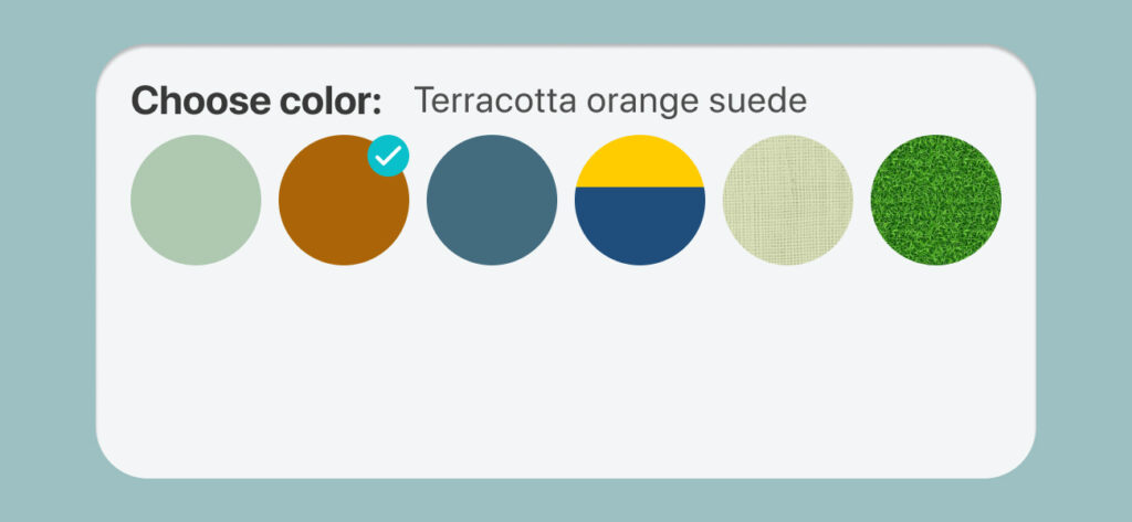
Product images are shown as a disc (masked). This is designed for selection of colors, textures (ostrich leather) or foils (like gold foiling). Uses a 1:1 image. Name of the attribute is displayed only when selected. Descriptions ignored.

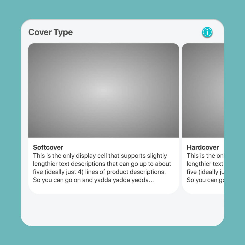
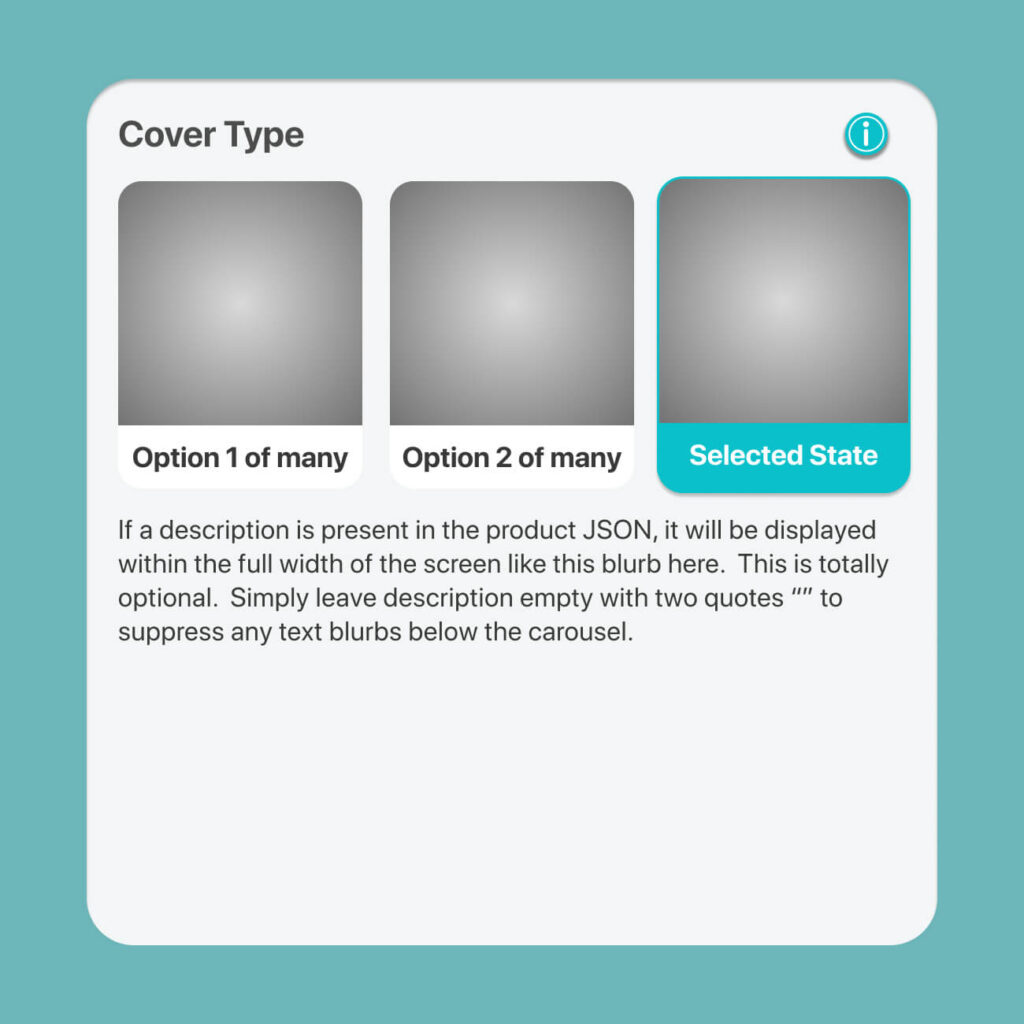
For features where a larger image and short description within the car is needed.
Image is 8:5 aspect, which collapses into a 1:1 square thimbnail upon selection.
This is the only style which features a blurb of text description.
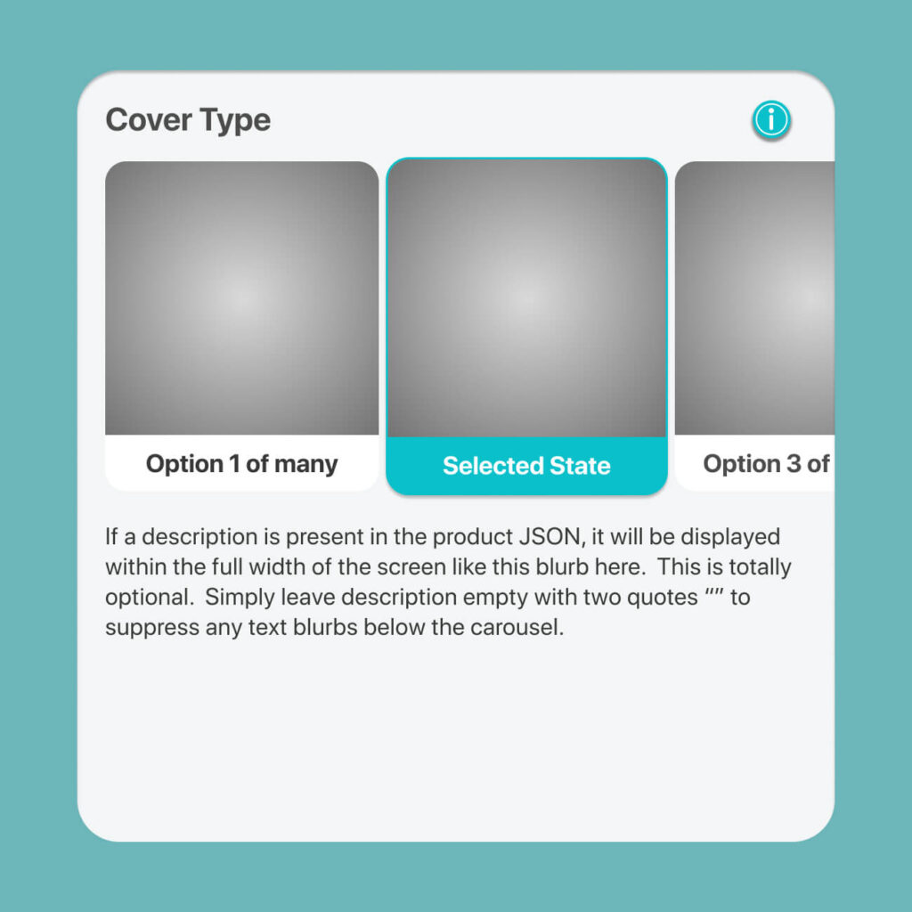
This gives you 2.5 visible tiles which scrolls horizontally. Description (if present) of the selected tile will disoplay across entire width of screen.
This is the smallest Carousel style we have which gives you 3.3 visible tiles. Same behavior as Carousel Medium.
If you do not want to scroll, and only have 2 or 3 (ideal) or 4 (maximum) choices, then this row of Thumbnails may be suitable. Do not that the image will be displayed 1:1 for 3 tiles (and squeezed to 2:5 for 4 tiles).
Descriptions (if present) of selected tile will display across width of screen.
photobook.ai uses AI to automatically create photobooks and other printable products. We provide white-labelled native mobile and progressive web apps to ecommerce and print suppliers. Through our network, we fulfill print products globally for clients who want to produce closest to their customers to reduce their carbon footprint and yet be competitive in their offering.